
This post is part of an on-going series about the widgets included in LiveCode 8 and how to get the most from them. In previous posts, you can read about the line chart, the SVG path, the header bar and the navigation bar.
The segmented control shows several options (“segments”), and allows one or more of them to be highlighted by clicking on them. Each segment is identified either by a label, or an icon.
We chose to include a segmented control widget in LiveCode 8 because segmented controls are quite widely used in modern user interfaces. For example, Xcode uses a segmented control at the top right of its main project view to allow quick access to toggling parts of the user interface without using a large area of the screen.
Controlling text alignment
One of the ways that we use the segmented control in the LiveCode IDE is to control the alignment of text. You can find it used in that way on the Property Inspector’s “Text” page for the Field control, for example.
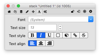
The Property Inspector uses segmented controls as property editors.
To build a similar control, create a new stack and drag a field and a segmented control onto it from the tools palette.
Open the Property Inspector for the segmented control, and set the “Display style” (the itemStyle property) to “icons”. This will display an icon for each segment, instead of a textual label. The segmented control is set up with the text alignment icons that you need by default.
Next, set the “Segment names” to “left”, “center” and “right”. This itemNames property allows you to associate a value or tag with each segment, separately from the text that’s displayed on the control. I usually think of the itemNames as values that have meaning to the app, and the itemLabels as values that have meaning to the user. The segment names and labels are similar to the tags and labels used by LiveCode menus.
Finally, you need a script for the segmented control. When the user changes the highlight of the segmented control by clicking on one of the segments, it sends the hiliteChanged message, and your script should handle this message to change the field’s textAlign property.
on hiliteChanged
   set the textAlign of field 1 to the hilitedItemNames of me
end hiliteChanged
And that’s it. Switch to browse mode, and click on the segmented control to change the alignment of the field’s text.
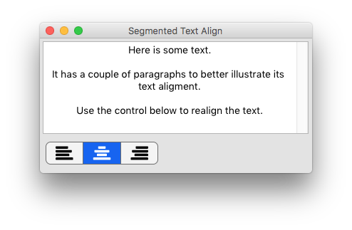
Alignment control with a segmented widget.
A 5-star rating control
By adding some script support, you can use the segmented control to create some controls that would be quite difficult to do using “classic” LiveCode controls. For example, you can build a “5 star rating” control quite quickly. When you click on a segment, the control will display filled stars for the segment you clicked on and all the segments to the left, and empty stars for all the segments to the right.
Create a new segmented control, set it to display icons, and give it 5 segments. Next, go to the “Icons” pane of the Property Inspector. Set all the “Segment icons” (the itemIcons property) to the “empty star” icons, and all the “Hilited segment icons” (the hilitedItemIcons property) to the “star” icon. You should now be able to click on individual segments to have them turn from an empty star to a full star.
To get the star rating to work properly, however, it’ll be necessary to allow multiple segments to be highlighted. You can do this on the “Basic” pane of the Property Inspector by enabling the “Multiple hilites” (multipleHilites) property.
The appearance of the control is almost right, but why not tweak the colours too? It would be nicer if the stars changed colour when highlighted, but the background colours of the segments stayed the same. To do this, go to the “Colors” pane of the Property Inspector. Change the “Hilited segment label color” (hilitedTextColor) to blue, and the the “Selected segment color” (hiliteColor) to the same grey background colour as used for the “Segment color” (backColor).
The final part is to add a script that hooks this all together, and makes sure that the correct segments are highlighted when the user clicks on the control by responding to the hiliteChanged message. The hilitedItems property contains the segment numbers that are highlighted.
The script first checks which segment was clicked, and then creates a new value for the hilitedItems that includes all the segments up to and including the clicked segment.
local sRating
on hiliteChanged
   local tHilited
   -- Find the rightmost item that changed.  This is
   -- the segment that the user clicked
   put the hilitedItems of me into tHilited
   repeat with tSegment = the itemCount of me down to 1
      if tSegment is among the items of tHilited then
         if tSegment > sRating then
            put tSegment into sRating
            exit repeat
         end if
      else
         if tSegment <= sRating then
            put tSegment into sRating
            exit repeat
         end if
      end if
   end repeat

   -- Highlight all the segments up to and
   -- including the one that was clicked
   local tNewHilite
   repeat with tSegment = 1 to sRating
      put tSegment & comma after tNewHilite
   end repeat
   -- Remove trailing comma
   delete char -1 of tNewHilite
   set the hilitedItems of me to tNewHilite
end hiliteChanged
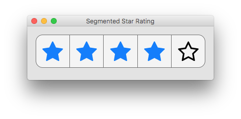
A 5-star rating control built with the segmented control widget.
Going further
There are many other good uses for the segmented control: you can use it for switching between cards, as a row of options that can be toggled, or possibly even to create an upvote/downvote control in a forum comment-viewing app.
How are you using the segmented control widget in your apps?
7 comments
Join the conversationPaul McClernan - December 2, 2016
…or you could use my 5 star Widget (that allows 10 positions with half-stars)
http://github.com/PaulMcClernan/community.livecode.widget.fivestars
MaxV - December 14, 2016
I tried the code of 5 stars, but it doesn’t work. I get always just 1 star. It seems that it resets itself
Peter Brett - December 15, 2016
I just rebuilt it from the instructions in the blog post, and it seems to work for me. Did you enable the Multiple hilites property of the widget?
MaxV - December 16, 2016
Peter, you are right; I missed the sentence with the multiplehilite. Thank you
Roger Mepham - January 21, 2017
The segmented control works very well as a pages control for iPhone apps by setting the icons as roundels and in the stack script:
On preOpenCard
set the hilitedItems of widget “Pages” to the number of this card
end preOpenCard
Max Schafer - March 9, 2017
I’ve tried using widgets, but I find the labels and SVG images revert back to their original state, even after saving. It seems like a bug.
Ali Lloyd - March 9, 2017
Hi Max, the SVG image reverting after saving was a bug, fixed by Bernd (https://github.com/livecode/livecode/pull/5232). So this should no longer be an issue in the next releases. If any labels are reverting that may still be a bug though, could you file a bug report please?