
Following Ali’s blog about the navigation bar widget another must-have control we wanted in LiveCode 8 was the header bar. As with the navigation bar this is a very common control in mobile apps and hopefully providing it as a widget will save you time, effort and some of the headaches associated with creating native-looking mobile applications.
The LiveCode header bar is based on the iOS Navigation Bar and the Android App Bar. If you are working on Mac a header bar widget will be themed like an iOS Navigation Bar, if you are working on Windows or Linux it will be themed like an Android App Bar.
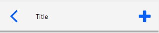
Windows
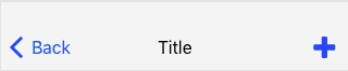
Mac
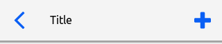
Linux
The header bar can be used to allow the user to navigate around your app and take actions, providing a visual structure to your app.
Where the navigation bar allows the user to switch between the screens of your app the header bar can allow the user to navigate within a section of the app.
For example in the iOS Clock app the navigation bar widget allows the user to switch between the World Clock, Alarm, Stopwatch and Timer screens but the header bar allows the user to choose to Edit or Add an alarm by navigating to another screen within the Alarm section of the app.
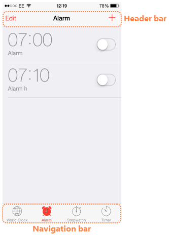
As well as navigating around the app the header bar can also be used to provide access to options such as search, save and delete.
Using the Header Bar
The header bar gets a mouseUp message when it is clicked on, you handle this message to take the appropriate action for the chosen action.
The default script of a new header bar is
on mouseUp
   local tActionName
   put the mouseAction of me into tActionName

   if tActionName is not empty then
      -- Execute script triggered by the given action
   end if
end mouseUp
Firstly we get the value of the mouseAction property, which gives us the name of the header action that was just clicked, allowing us to do something different depending of what action was clicked. For example
on mouseUp
   local tActionName
   put the mouseAction of me into tActionName

   if tActionName is "back" then
      go to card "messageList"
   else if tAction is "add" then
      go to card "newMessage"
   end if
end mouseUp
Note: it is import to remember that the mouseAction property gives you the action name, not the label. Both can be set in the Property Inspector.
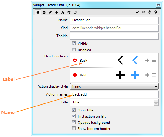
The label is the text that is displayed for an action, when the Action display style is set to “text”. The name is the name of the action, as returned by the mouseAction property.
Customising the Header Bar
The actions displayed in the header bar, and the appearance of the header bar itself, can be controlled using the Property Inspector.
The header bar can
- Show a title
- Have the first action on the left
- Have an opaque background
- Have a bottom border
- Use icons or text for displaying actions
The Property Inspector also allows you to set up all the actions that are shown on the header bar, setting the label, icon and highlight icon for each action and allowing you to reorder, add and delete actions.
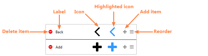
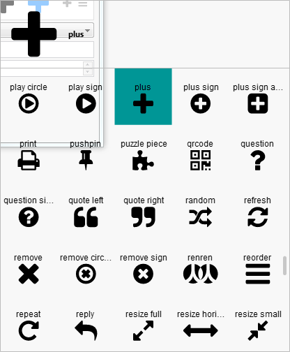
When one of the icons is clicked, a scrollable icon picker is popped up to allow you to choose a new icon. The current selection is highlighted as shown.
The icon and highlighted icon can be different, to allow further visual feedback about what is currently selected.
The colors of the navigation bar are controlled by the foregroundColor, backgroundColor, borderColor, and hiliteColor properties as usual for LiveCode controls. Changing these properties allows you to customise the header bar to fit in with the design of your app.
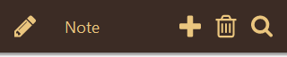
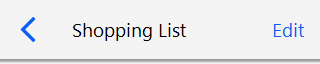
Examples
Messages Header


Notes Header
Scripting
Beyond handling the mouseUp message and using the mouseAction property to act on the selected action the other thing you might want to do with your header is to update it depending on the state of the app. For example if you choose to Edit an item in a list the header options might change to “cancel” and “save”, or similar. You can change the header actions in script by setting the itemLabels, itemNames, itemIcons or hilitedItemIcons properties of the header bar widget. The values of these properties are comma-delimited lists and can be updated using chunk expressions.
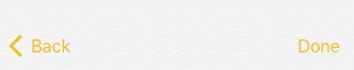
This example shows how to switch a header bar action between “edit” and “done”
![headerChange1]](https://livecode.com/wp-content/uploads/2016/05/headerChange1.png)
on mouseUp
    local tActionName, tActionNames, tActionLabels
    put the mouseAction of me into tActionName
    put the itemNames of me into tActionNames
    put the itemLabels of me into tActionLabels

    if tActionName is "edit" then
        put "done" into item 2 of tActionNames
        put "Done" into item 2 of tActionLabels
        set the itemNames of me to tActionNames
        set the itemLabels of me to tActionLabels
    else if tActionName is "done" then
        put "edit" into item 2 of tActionNames
        put "Edit" into item 2 of tActionLabels
        set the itemNames of me to tActionNames
        set the itemLabels of me to tActionLabels
    end if
end mouseUp
If you have already used the header widget, or plan to in a new app or app you are refactoring for LiveCode 8 let us know what you are doing with it in the comments.
9 comments
Join the conversationAmigatech - May 15, 2016
I would like the header themed for Android even though I am developing on a Mac. Can I change this to be default behavior?
stephen - May 15, 2016
This is also what I would like to have happen, “header themed for Android even though I am developing on a Mac”, allowing me the freedom of continuing development on my mac. I should think there is an option/handler for setting the theme of the widget to ios or android?
stephen - May 15, 2016
Is there a way to turn off the label names of the widget? and can we make the widget behave like a background object to show up on any new cards created? I could not find the option to do that, except if I copy and paste on each new cards created. Having this behave like a background will allow writing one routine which takes care of multiple scenarios existing on every other card and not worry about maintaining multiple code routines on however many headers one has in an app.
William - May 15, 2016
If you put the widget inside a group you can make it behave like a background.
Elanor Buchanan - May 17, 2016
Hi Stephen, you can set the itemStyle property of a header bar to either “icons” or “text”.
The left action is always themed in a particular way though, on iOS the icon and label is always shown and on Android only the icon is shown.
Ali Lloyd - May 16, 2016
You can do
set the theme of widget “headerBar” to “Android”
to preview the appearance of the header bar on Android when developing on Mac. Note this property is not persistent, so it will need to be set any time the widget is loaded. You could put the above in a preOpenCard script if you want to always override the theme.
Jim - July 22, 2016
I’ve tried
set the theme of widget “Header Bar” to “Linux”/”Android”/”iOS”
but never see any difference. I put this into the preopencard script as Ali suggested.
I also wondered if there was a way to center the header label on the card without setting the whole theme to Mac/iOS. I tried the following but it had no effect:
set textAlign of field “label” of widget “Header Bar” to “center”
William - April 7, 2017
Any pointers on how to script itemIcons and hilitedItemIcons within the widget?
Elanor Buchanan - April 21, 2017
Hi William
The icon and hilitedIcon are part if the itemArray property. This is a numerically keyed array property with an element for each action. Each action element has the values hilited_icon_name, icon_name, label and name.
To set the icon or hilitedIcon in script you could do something like
put the itemArray of widget 1 into tArray
put “star” into tArray[1][“icon”]
set the itemArray of widget 1 to tArray
Have a look at itemArray entry in the Header Bar API in the Dictionary for more on the property.
I hope that helps.
Kind regards
Elanor