
Continuing the blog series on the initial set of widgets included with LiveCode 8.0, here we are going to look at the SVG Path widget in a bit more detail (go here for the Navigation Bar blog and here for the Header Bar blog).
What is SVG?
SVG stands for Scalable Vector Graphics. An SVG image file is essentially a set of instructions about how it should be drawn. SVG paths are sequences of commands which specify how the path is constructed from co-ordinate to co-ordinate (see the specification for SVG paths). This is how the scalability of SVG images is achieved – in order to scale it one simply has to adjust the scale used by the canvas. The SVG path widget only deals with the ‘path’ element of an SVG image. A prototype of full SVG rendering capabilities has been written, however there is a lot to do before SVG can be fully integrated into the engine so that SVG images can be used for button icons and so on.
Widget Properties
The SVG path widget has a number of properties which control how the path is displayed.
Paths
The SVG path displayed by the widget is either one of the named ‘preset’ paths, or any basic SVG path. Setting either the iconPresetName property or the iconPath property will override any setting of the other property. The iconPresetName is one of the preset icons which can be listed using the iconNames() function, or selected via the property inspector. Clicking the currently set icon in the property inspector will bring up the icon picker, allowing you to pick one of the preset icons. Setting one of the preset icons will cause its iconPath property to be set to the path of the current icon. If there is no preset path that fulfils your requirements then you’ll have to set the iconPath property to the SVG path of the image you want. Some information on extracting valid SVG paths from images are discussed at the end of this post.
Highlighting
The hilite property can be used to alter the appearance of the svg path widget to indicate it has been clicked, for example. The fill color of a highlighted svg path widget is determined by its hiliteColor.
Although this effect can also be achieved by changing the foreColor property, the advantage of setting the hilite property is that the hiliteColor, if empty, will be inherited. Thus you can ensure consistency of highlight colors by setting the hiliteColor of the group or stack containing the widget.

Rotation and Reflection
The angle property can be used to rotate an svg path. This can be handy if you need to tweak one of the preset paths, for example to make a finger point at something from a slightly different direction:

The flipped property can be used similarly. For example, here it is used in conjunction with the angle property to make a fire extinguisher icon face the other way.

Aspect Ratio
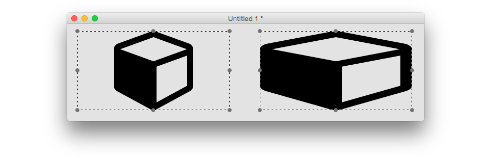
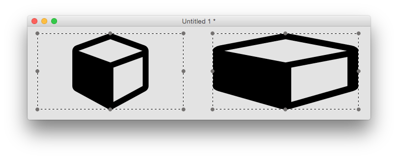
The maintainAspectRatio property determines whether the path is stretched to fit the object bounds or not. For example, the cube icon will always be a cube if maintatinAspectRatio is true, but can be stretched to a cuboid if not.
Fill Rule
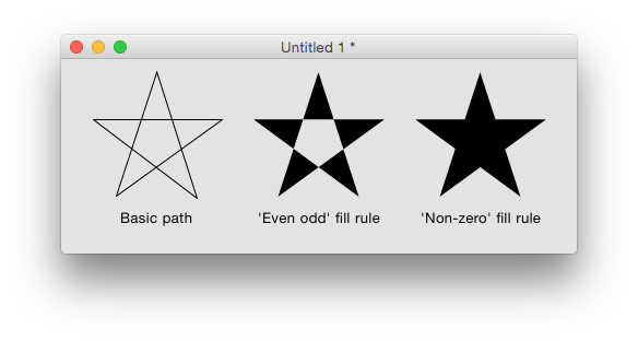
SVG paths can cross over themselves, which causes an ambiguity when determining what exactly constitutes the interior of the path (for filling purposes). The fillRule property controls how the engine chooses what to fill. Take for example a five-pointed star, defined in a simple way using a moveTo command and five lineTo commands, e.g.
M4,47h117l-95,69 36-111 36,111zThe two available fill rules work by determining how many path segments are crossed by a straight line going infinitely in one direction from a given enclosed region. Using the above example, starting anywhere inside the central pentagon of the star, such a line would always cross 2 path segments. The ‘even odd’ fill rule states that a region should be filled if this number is even, and not filled if it is odd. The ‘non-zero’ fill rule states that a region should be filled if this number is non-zero.
So for the five-pointed star example above, we have the following results:
Width and Height
All LiveCode objects have width and height properties, and the SVG path widget is no different. However, these do not necessarily reflect the actual bounds of what is drawn – for example if the maintainAspectRatio property is set to true, as can be seen in the cube / cuboid example above, there may be a significant difference. From 8.1, the SVG path widget will have scaledWidth and scaledHeight properties, contributed by Hans Behrens, which return the width and height of the path as it is currently being rendered.
Bonus tip:
Did you know that objects’ contextual (right-click) menus now contain a ‘Show Documentation’ item? Selecting this will take you to the appropriate place in the dictionary to find out all the syntax associated with that object / widget. Give it a try with an SVG Path widget to see descriptions of all of its associated properties.
How to get SVG paths
Unless you have extremely good visualisation skills it will be pretty difficult to pluck SVG paths out of thin air. Many image manipulation programs allow images to be exported as SVG, and there are many SVG files available online, for example at Open Clipart, however these cannot always be converted into simple SVG paths.
If an SVG file consists of a simple polyline element, you can often convert it to the correct form by putting M (moveTo command) before the first co-ordinate, L (lineTo command) before the second co-ordinate, and adding Z (closePath command) at the end. This works for example when creating a polyline svg using an online drawing website such as Vector Paint.
If the SVG image consists of multiple path elements, Greg Miller has provided a very handy stack on the LiveCode forums which allows you to import a multi-path SVG file and display in an SVG Path widget.
Join the conversation