
I’m excited to write about this widget! I’ve really enjoyed playing with it over the last few weeks and challenging it to discover the styles of lists that I can produce with it. I can say confidently, any style of vertical scrolling list I have tried to build with it, I’ve been successful with. Let’s jump in.
PolyList – it’s a new LiveCode widget that allows you to display your data in a custom list view. You can build single or multi column lists that can contain text, images, SVGs and color fills, and you have full control over the style and position of everything. Take a look at this short video to get a sense of the incredibly cool lists you can build in LiveCode with PolyList.
Let’s walk through one of the list styles that I built in this demo video which will give you insight to just how useful this widget can be.
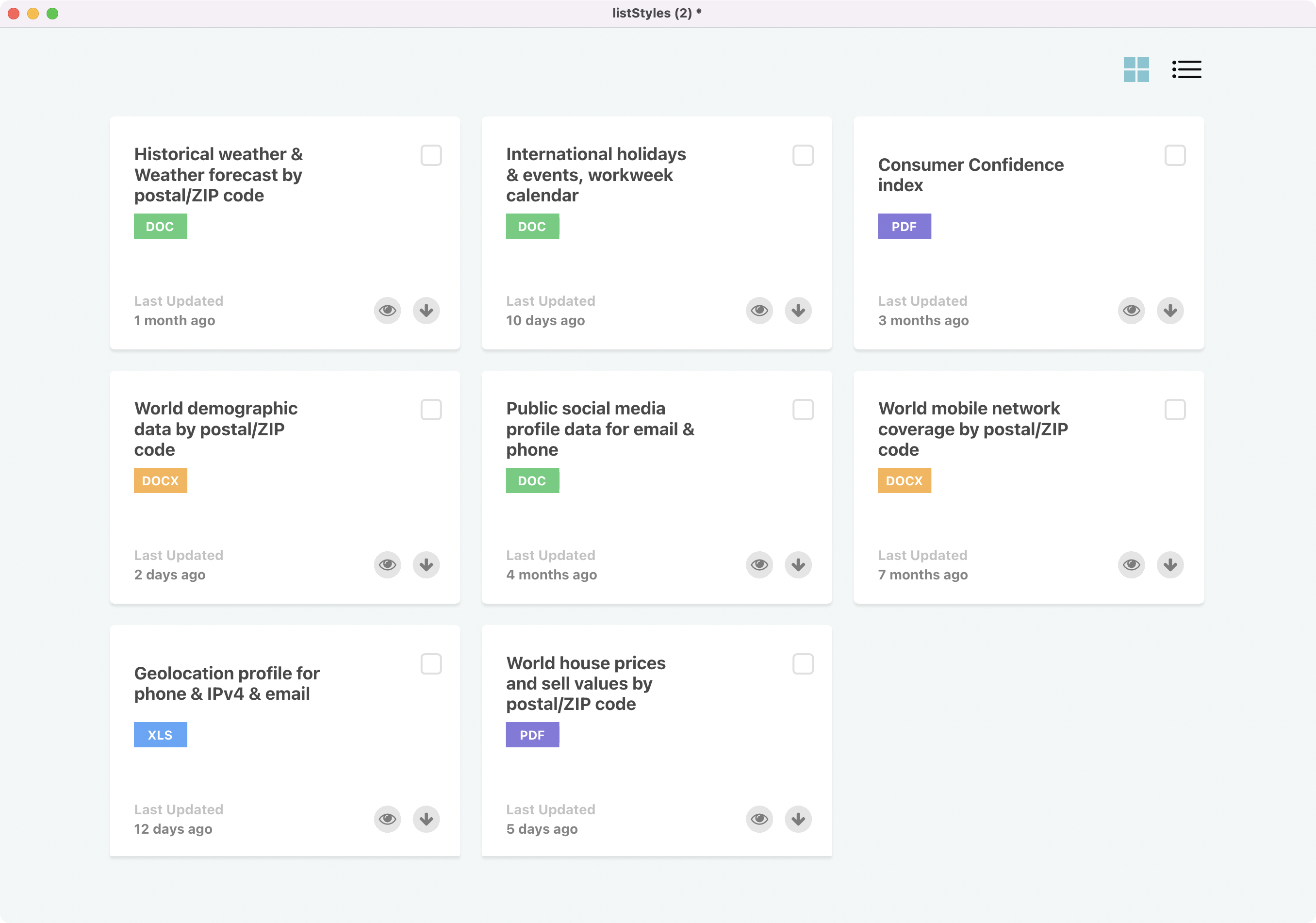
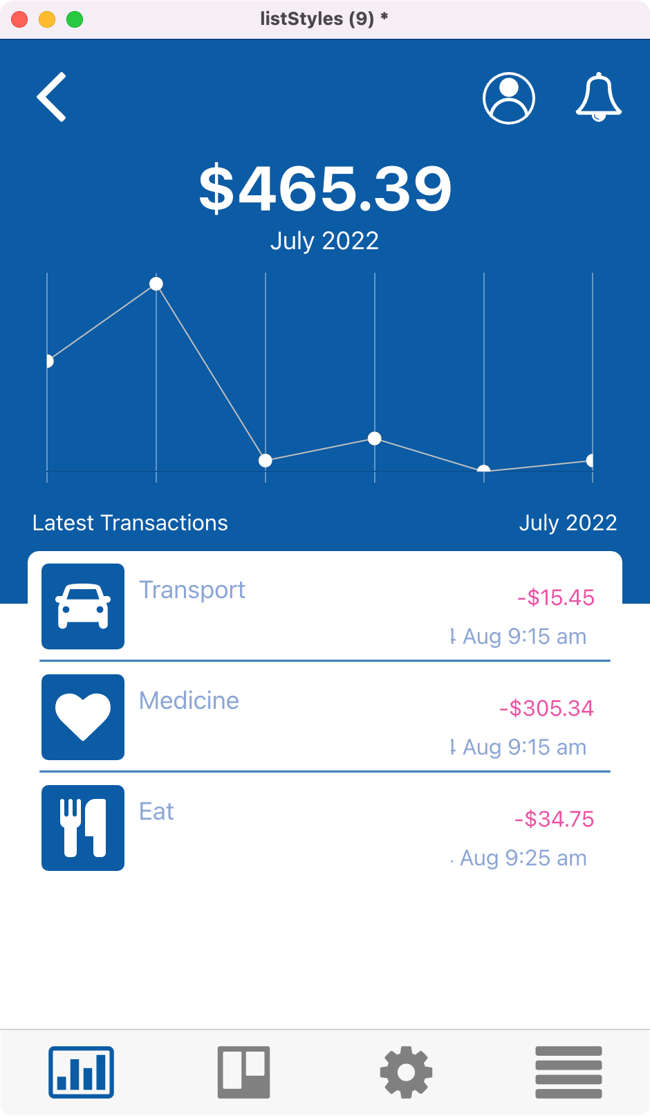
This multi column list contains
- Title Text
- Document Type with corresponding background color
- Checkbox (SVG)
- Last Modified title text
- Last Modified timeline text
- View icon (SVG)
- Download icon (SVG)
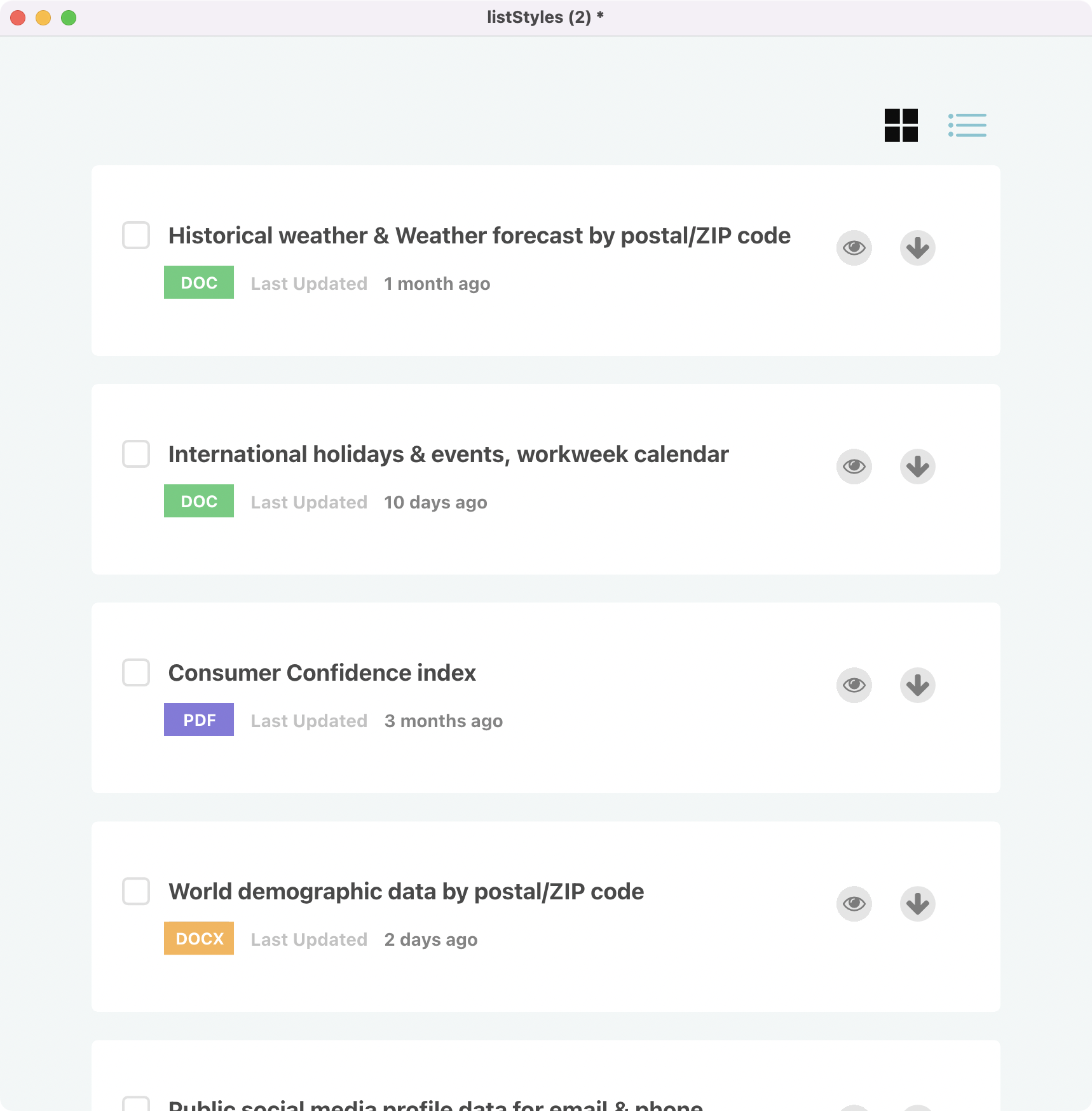
You may have also noticed in the video that this list had two different views, the one above is a multi column block style view and the one below is a standard single column view. It’s the same list, we are just changing the layout.
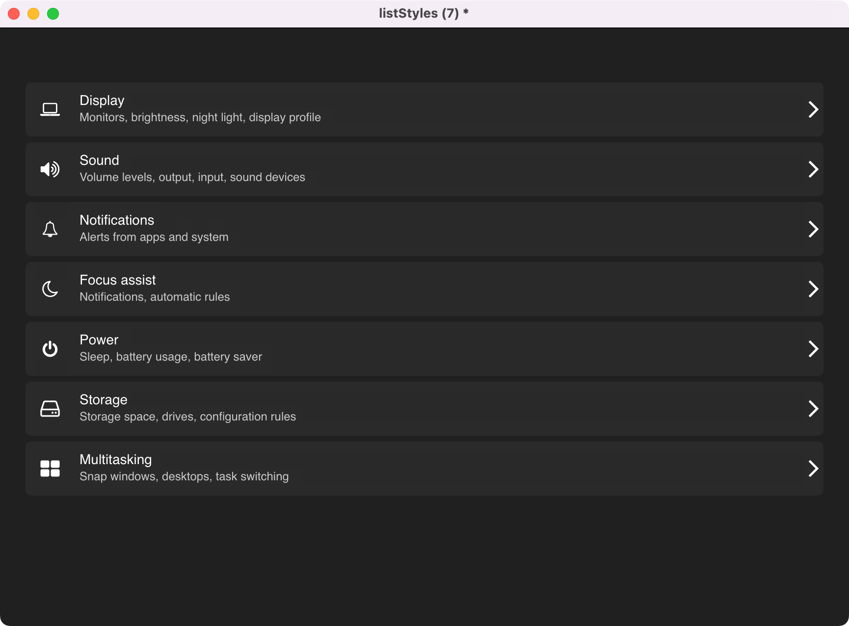
So how did I put this together? Was it easy? Can you do it? The answers are, I’ll show you, pretty easy, and yes you can. First, let’s look at styling your list. Once you have dragged out the PolyList Widget onto your card you want to open up its property inspector.
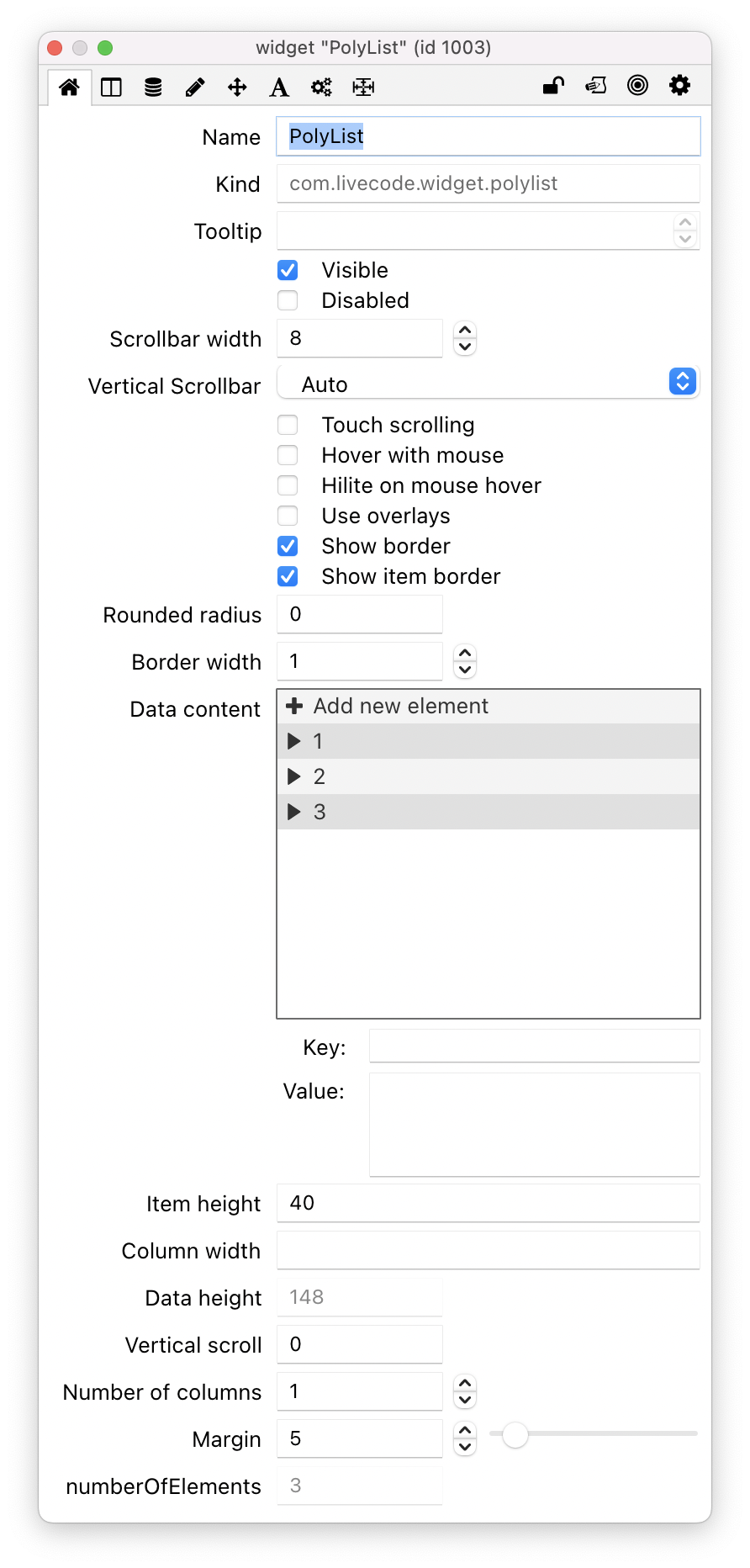
On the first tab of the property inspector you will see various properties that will help you get your list setup the way you want. You will see a treeview on this tab, this is your data content and we will come back to this in just a moment, lets focus on getting the look right first. Below the tree view in the above screenshot you can set the height and width of the individual list item and you can set the number of columns and the margins between each individual list item.
Now that we have added these properties we can get stuck into constructing all of the elements we need for our list. To do that we head to the next tab to find a custom style editor for PolyList.
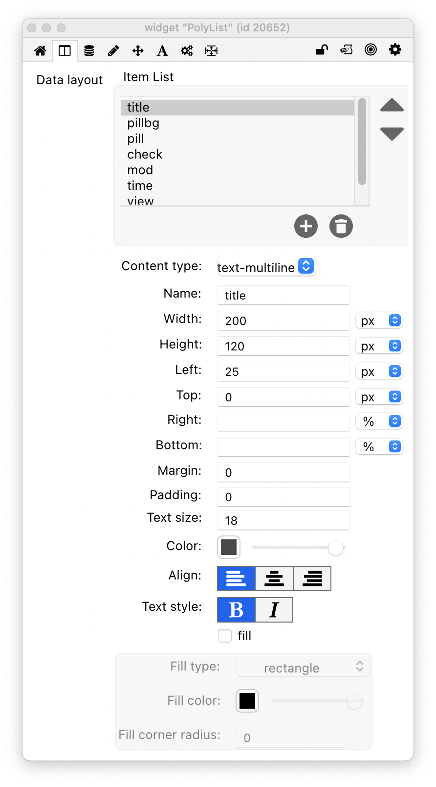
The above is a screenshot of the PolyList column editor for the block style list screenshot shown earlier in this blog post. Let’s walk through it.
First you start to add the parts needed for your list. In the example above we needed a Title, and we needed that title to display across multiple lines, I needed it to be approx 200px wide, 120px high, and 25px from the left, I set the text size to 18, aligned it left and set the text style to bold. Changing any of these values will change how my title element appears on my list. This is creating your dataLayout and dataLayout is created as an Array. Note – In general when using this widget you don’t have to care about the dataLayout array, you simply set what you want in the property inspector. However you will need to know this if you want to change list style like I am doing in this particular demo. Here is a look the dataLayout array in a readable format for the block style list.
1 =
name = title
left = 25px
text-size = 18
color = 73,73,73,255
width = 200px
align = left
content-type = text-multiline
height = 120px
text-style = bold
top = 0px
2 =
name = pillbg
fill-type = rounded-rectangle
height = 26px
width = 55px
align = left
content-type = color
fill = true
text-style =
left = 25px
top = 100px
fill-cornerRadius = 5
3 =
color = 255,255,255,255
top = 101px
left = 27px
align = center
margin = 0
width = 50px
content-type = text
text-size = 13
height = 25px
padding = 5
text-style = bold
name = pill
4 =
name = check
right = 5px
width = 50px
height = 50px
align = left
content-type = icon
color = 224,224,224,255
text-style =
margin = 14
top = 15px
5 =
name = mod
left = 25px
text-size = 14
height = 200px
width = 200px
align = left
content-type = text
color = 194,194,194,255
text-style = bold
top = 90px
6 =
name = time
left = 25px
text-size = 14
height = 200px
width = 200px
align = left
content-type = text
color = 132,132,132,255
text-style = bold
top = 110px
7 =
color = 124,124,124,255
Bottom = 0px
fill-type = circle
top = 160px
align = left
margin = 1
width = 30px
content-type = icon
fill-color = 229,229,229,255
right = 60px
height = 30px
padding = 5
text-style =
fill = true
name = view
8 =
color = 124,124,124,255
Bottom = px
fill-type = circle
top = 185px
left =
align = left
margin = 1
width = 30px
content-type = icon
fill-color = 229,229,229,255
right = 20px
height = 30px
padding = 7
text-style =
fill = true
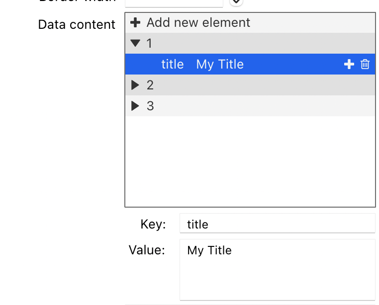
name = downloadNow that I have my list styled how I want, we can add our data. I said earlier in the blog post that we would come back to the treeview shown on the default tab of the property inspector. This is displaying the dataContent property and this is where we will add our data. We have the option to add our data manually into here, but, for anything other than a short list, that is probably not the most effective way of doing it. Let’s look at what is involved in adding data manually.
The dataContent property is an array and the treeview is displaying that array and also allowing us to add or edit the data. In the screenshot below there are 3 entries and I am adding data for our title section that we created in the Data Layout tab. The important thing to understand here is that they key matches the same value that you gave for the Data Layout item. So if we called it “title” in the layout section we must refer to it as “title” in the content section. As you add your data in here you will see it start to appear on your PolyList widget, this is a good opportunity to tweak any styling or layout issues. Indeed, it’s actually useful to have one section of data complete so you can get your layout and styling just right.
For anything more than a few entries, entering them manually is probably not the approach you will want to take. The dataContent property requires an array and for the list in our video that would look something like this.
1 =
	mod = Last Updated
	pill = DOC
	download = arrow down
	title = Historical weather & Weather forecast by postal/ZIP code
	time = 1 month ago
	view = eye open
	pillbg = 89,206,123
	check = check empty
2 =
	mod = Last Updated
	pill = DOC
	download = arrow down
	title = International holidays & events, workweek calendar
	time = 10 days ago
	view = eye open
	pillbg = 89,206,123
	check = check empty
3 =
	mod = Last Updated
	pill = PDF
	download = arrow down
	title = Consumer Confidence index
	time = 3 months ago
	view = eye open
	pillbg = 134,119,221
	check = check empty
First let me talk through a some of the items in our dataContent array. The items download, view and check relate to the icon content type we set out earlier in our dataLayout, this expects an SVG icon name. The easiest way I know to find out the name of the SVG icon in LiveCode is to drag out the SVG widget, browse through the list and take note of the icon name. Another item in our list worth pointing our is pillbg, in our list we are using the color content type to provide a background for our document type, this is what makes DOC green and PDF purple in our list.
There are a few ways we can add our data to our list. The first would be by setting the dataContent of our widget to our constructed array. That would look something like this…
set the dataContent of widget "PolyList" to MyArray
We also have the tsvData and csvData property, these properties are incredibly useful for importing TSV or CSV data directly into our list’s dataContent. Especially If like me in this example you have your data in a TSV or a CSV file. You simply have to tell the widget to set it’s data to your TSV or CSV data. In our example I pasted my TSV data into a field called “tsv” and added the following code to a button.
set the tsvData of widget "PolyList" to field "tsv"
This line put my tsv data into the dataContent for the widget. You could do the same with csvData.
So we’ve looked at creating our layout and adding our content and really that is the bulk of what you need to know to go ahead and start creating some really cool lists. Some other neat things to know about this widget are that touch scrolling works out of the box and your list will look the same on all platforms.
Going back to our demo list, you will have seen in the video that I am changing the layout of the list and I think it’s worth touching on that as it may be useful to know in certain scenarios. On my stack I have two hidden fields, each field contains a readable array that has the layout properties for each of the list styles (I got this readable format by creating my list style, and putting this into the message box revPutArray the dataContent of widget "PolyList" , I then pasted the results of this into a field). I added two SVG widgets to act as controls for switching between the list styles. Here is an example of the code added to one of the SVG buttons to control the list style switching
function getDataArray
     local tIndex, tArray
     set the itemdelimiter to "="
     repeat for each line tLine in field 2
          if char 1 of tLine is a number then
               add 1 to tIndex
               next repeat
          end if
          put char 2 to -1 of item 2 of tLine into tArray[tIndex][char 2 to -2 of item 1 of tLine]   end repeat
          return tArray
     end getDataArray

on mouseUp
     lock screen
     set the dataLayout of widget "PolyList" to getDataArray()
     set the itemheight of widget "PolyList" to 150
     set the numberofColumns of widget "PolyList" to 1
     unlock screen
end mouseUp
Just to quickly talk through what you see there; we have our function that takes our readable array data and turns it into a LiveCode array. Then we have our mouseUp data that sets the dataLayout to that array. We are also changing the height of the widget to go from block style to list style and changing the number of columns from 3 to 1. Note – you only really need to care about this if you want to do something similar to my example. If you just want to build beautiful lists you can do so with the controls available in the property inspector.
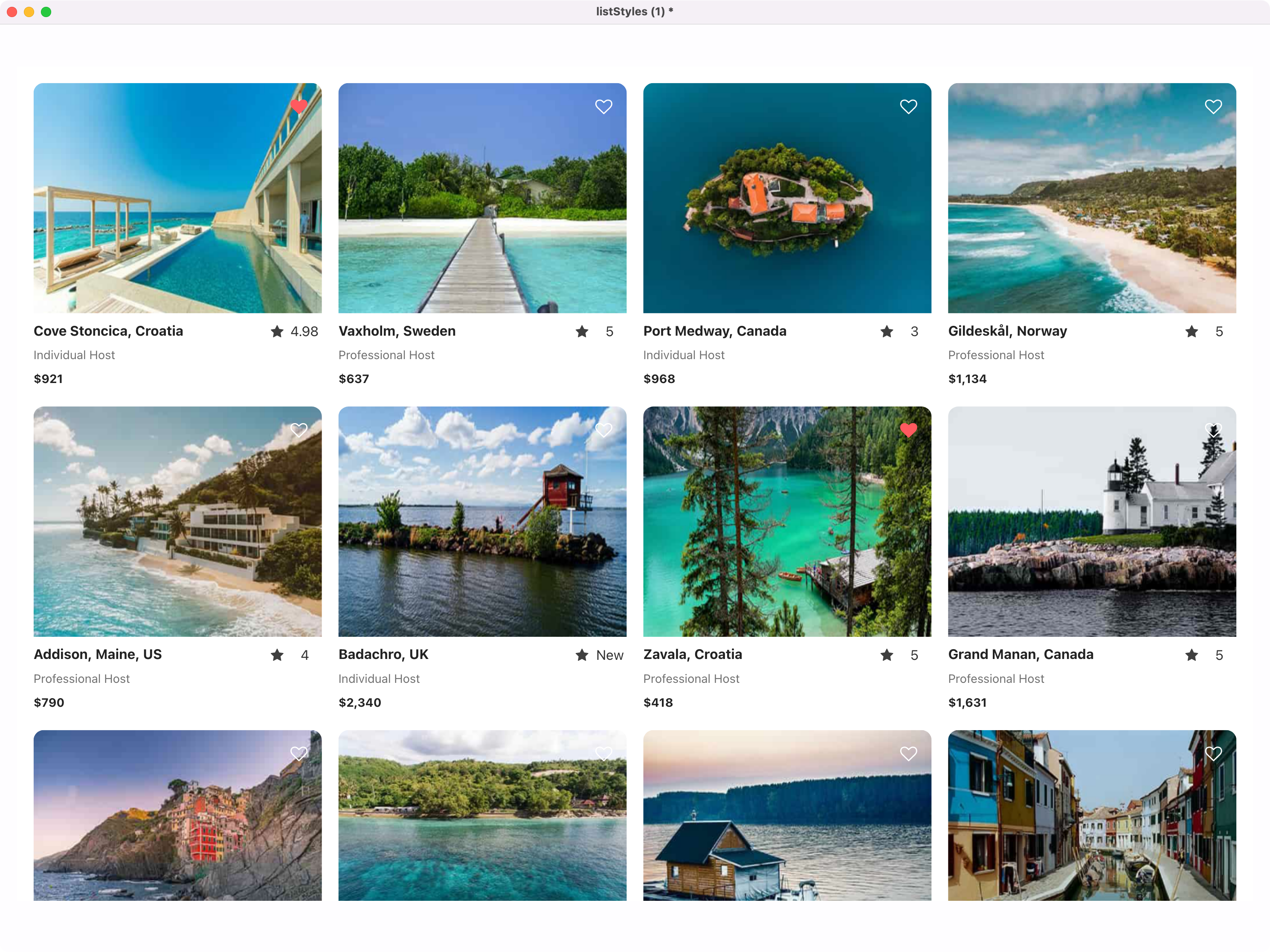
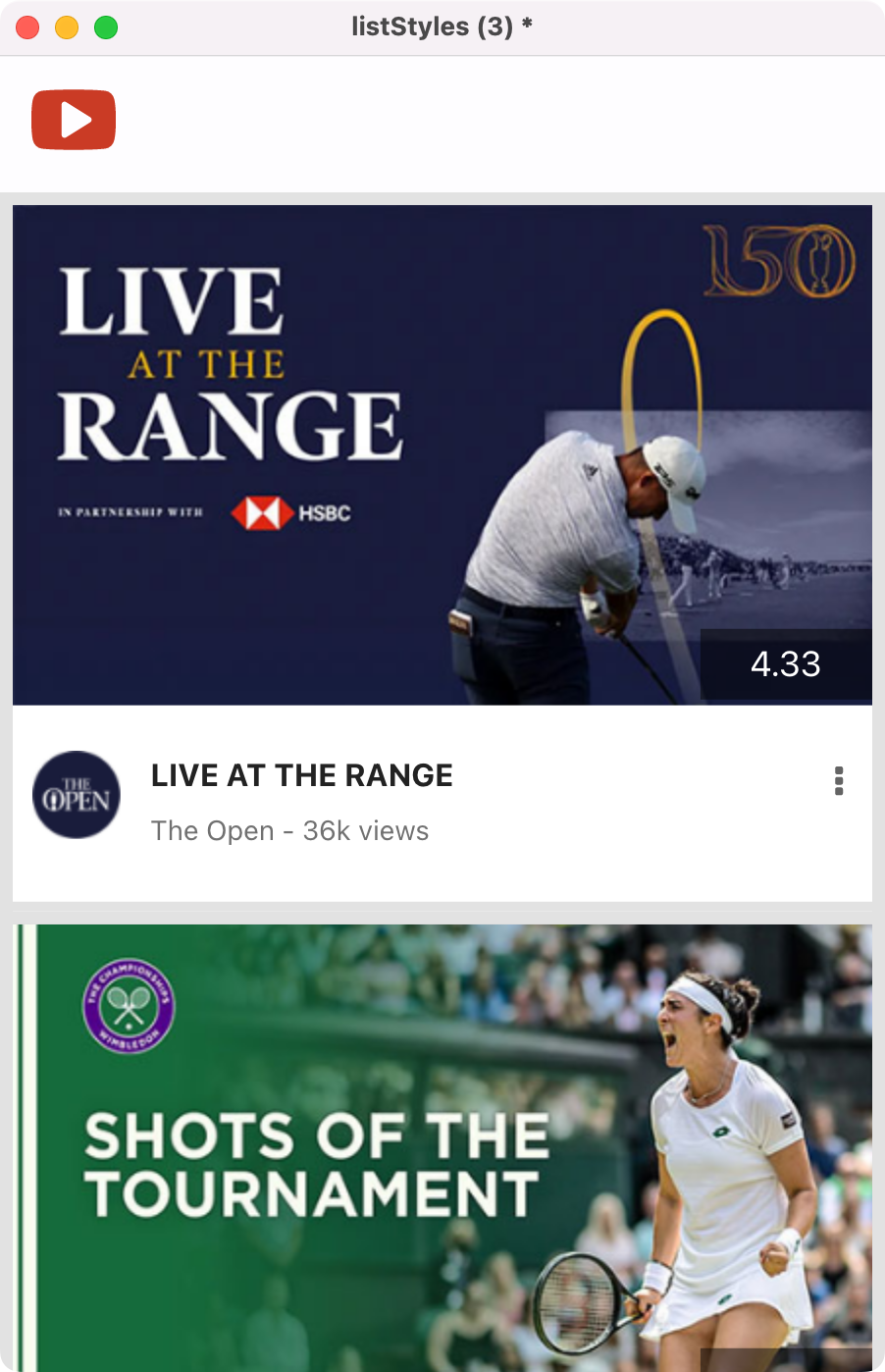
Talking of beautiful lists, here are a few other beauties that I’ve created as part of putting PolyList in the spotlight.
I’d like to round off this blog post by saying after spending a bit of time with this widget, it might be my new favourite. I love where it is today and I love where it can go. I’m not a professional developer but I’ve been able to build professional lists with the PolyList widget that I have struggled to make before without it. As always I would love to know what your thoughts are on what you have seen in this blog post, and if you have any questions on things I did or didn’t cover then leave a comment below and I will get back to you.
Note for the eagle eyed LiveCoder. PolyList was not a widget that was included in the Summer MegaBundle. PolyList is what was originally called DataView, we decided to change the name due to a conflict with another LiveCode extension. I encourage everyone who has already purchased the MegaBundle to make sure you are using the latest version as we have made a number of updates recently. For those that don’t have their hands on it yet, PolyList is available in the Extensions Store.
37 comments
Join the conversationTrevor DeVore - July 26, 2022
This looks awesome! Does Polylist support feeding data to the control incrementally? For example, if I wanted to implement infinite scroll where I was feeding it data from a paginated API?
If so, can you provide an example?
Steven Crighton - July 26, 2022
Hi Trevor. The answer is not yet but likely very soon. It’s something that will probably appear in an update to the widget in the very near future. We have the core of what you are asking for but there is a little update required to deal with the “infinite” part. Indeed one of the examples in the video was a photo gallery list that was loading both local and online images as it was scrolling. I will reply to this comment once that update appears along with an example.
Trevor DeVore - July 27, 2022
That is great news Steven. Three other questions –
1) I see in the video that the heart icon responds to a click and the icon changes. Does each element dispatch mouse enter/leave events as well so you can change the look of individual elements in response?
2) For text elements is it possible to determine that the text will overflow the available bounds and add “…” or a UI element that let’s the user know there is more text?
3) Can you assign a tooltip to individual elements in each row?
Steven Crighton - July 27, 2022
Hi Trevor – Firstly I did say it was coming soon. I now have a working example in front of me that I think would allow you to create what you are looking for.
I might email you these stacks as that might be easier to explain but let me try to show you what I have.
I have a stack that is an infinite scrolling list, where more and more rows are added with new data as we scroll. Here is a look at the code required to achieve that.
I’m hoping this gives you an idea that you will be able to do what you are looking to do with PolyList.
Steven Crighton - July 27, 2022
Let me take these one at a time.
1) In the latest version of PolyList yes you can do this. The code example below is an example of how you would achieve that.
2) Not yet but it makes perfect sense and as I look around lots of popular lists, they do exactly this. We will add this and we will probably have it included in the next update.
3) Yes – that is also included in the code example below.
Here is how that plays out
Hope this is helpful. Let me know if you have any follow ups.
Steven Crighton - July 28, 2022
Edit to the above comment. I have just tested and uploaded a new version that now adds “…” to the text content type if there is more characters than the space of the text area allows
Trevor DeVore - July 28, 2022
Thanks for the examples and the quick updates. I have one follow-up question.
1) I assume that showing a menu for the action subItem (vertical ellipses) is handled in a subItemMouseDown message. How would one make sure the option menu appears at the bottomleft of the subItem widget? Do you have to fetch the subItem props, translate the bottomLeft of it’s rect from local widget coordinates to global, and then use ? I ask because there is bug #5480 which would make it so this approach wouldn’t work. You would have to display the popup where the user clicked which wouldn’t be the desired result.
Steven Crighton - July 29, 2022
So this is something we have discussed but is not yet in play, I fully expect in the next update to have the ability to obtain the rect of a sub item and the rect of an item which would give you the control you are looking for. I’ll update on this comment when that is finished and in the widget.
Steven Crighton - August 2, 2022
Hi Trevor, so I’ve just tested and uploaded a new version which I believe addresses what you are looking for.
Firstly here is an example of the code
And here you can see I am placing a graphic over the sub items on mouse over.
Let me know if you have any more questions re this. Happy to help.
Trevor DeVore - August 2, 2022
Steven 0 the subItemRect property which returns the rect of the subItem that the mouse is currently over seems like it would do the trick. The only question is whether or not Bug id #5480 comes into play when trying to display a menu at the bottomleft of that rect when the user clicks on a subitem. Are you able to confirm whether or not that is the case?
Steven Crighton - August 2, 2022
Hi Trevor, I think if I understand correctly that it is not the case. Here is an example that we already had which hopefully confirms that. Below is what the code would look like and in the video I change which sub item the menu appears in at the bottom left of that sub item. So I think it’s all good for what you are looking for?
Jacques CLAVEL - July 27, 2022
A dummy question : how to update ?
My widget version number is dataview 1.0.3 and appear in the tools bar as Data View.
This version seems to be 1 column only.
I don’t know how to update
Steven Crighton - July 27, 2022
Hi Jacques. For the moment you have to update the new widgets manually. To do this, first log in to your LiveCode account. In the left hand navigation make your way to Products > thirdparty. Scroll down this list to find LiveCode Enhancements and download that bundle. Inside the bundle folder there is a widgetpackinstaller.livecode file – If you want to update everything in your bundle in one go I recommend using that. Simply open that stack and click the install button. Note – DataView will now be PolyList after you have updated.
Jose Damaso - August 2, 2022
Hi Steven – Polylist looks great! Is there a subItemMouseUp that I can use to effect an action on an element? How can I set a custom property on a subItem when feed the data content in as an array? And are there some example stacks that we can look at?
Steven Crighton - August 2, 2022
Hi Jose – Really happy to hear that you are excited about PolyList. If you watch the video on this blog post – you will see that on mouseup I am changing sub items on click. For example the love heart on the AirBnB style list is changing from a white outline to a red fill heart. To achieve that specific example here is the code that was used.
With regards to example stacks.. I have quite a lot of examples that I created for this blog post and in general testing of the widget. They are not anywhere for download just yet but I will include them in the widget bundle download. This will include access to AirBnb style list and many others which should be useful to look through. I will aim to do that by tomorrow and I will reply to this post once that has been done.
Steven Crighton - August 2, 2022
Hi Jose, I have just uploaded an update to the bundle which now has PolyList inside the examples folder. Within there you will find a few examples including some of those seen in this blog post. You can get this update by logging into your LiveCode Account, heading to the third party section and re downloading the LiveCode Enhancements bundle. In order for some of the examples to work you will need to make sure you have the latest version of PolyList installed which is also included in the bundle download.
Jose Damaso - August 4, 2022
Great! Thanks for the quick work and updates. This widget is so cool.
Steven Crighton - August 5, 2022
Thanks Jose. Really happy that you are liking the widget
Sandro - August 3, 2022
Hi Steven – Polylist looks very great, just one question: can the list also scroll horizontally? (similar to a timeline) 🙂
Steven Crighton - August 3, 2022
Hi Sandro, thanks for your comments on PolyList. At this moment PolyList does not support Horizontal scrolling lists. However it is something that we have been talking about and have been looking into the best ways to potentially add horizontal support to this widget. So not yet, but maybe in the future. It would be cool to add it.
Steven Crighton - August 5, 2022
Hi Sandro, It’s not ready for release just yet but I have just tested a version with Horizontal scrolling. Stay tuned, there will be more to come on this.
Sandro - August 5, 2022
Hi steven,
These widgets, and in particular Polylist, are fantastic. I am seriously thinking of making the purchase of the Megabundle.
It’s nice to see the blog return very active.
Steven Crighton - August 5, 2022
Thanks Sandro. I’m really pleased you are enjoying all the content. We are having fun making it. I agree re PolyList, it might be my favourite widget.
Ray Harding - August 4, 2022
Hi Stephen, I am new to livecode (it is awesome by the way) currently I’m porting over an application that was written in filemaker. One of the last tasks I will need to tackle is to create a daily time slot booking system, is a polylist something that could help me achieve this. Thanks.
Steven Crighton - August 5, 2022
Hi Ray. Firstly welcome to LiveCode, It’s really great to hear you are having a good time with it. The answer to your question is maybe. Depending on your requirements PolyList might help you achieve it but PolyGrid is also worth checking out for that purpose. I am working on a blog post where I will be doing something in PolyGrid that might be useful for you to see. However to show the power of PolyList and how it could be the right option for you, here is a demo I put together in just 12 minutes from start to finish. This is a simple 4 column list where each column has just one element in it and that is a time slot which is just a text element.
As you can see I am highlighting the selection and then storing the content of that selection to confirm the time to the user when they hit the button. It’s simple, it looks good and I think it shows where PolyList might be able to help you. Here is the sample stack, you will need to have the PolyList widget and the Power Button widget installed in order for this to work – Daily Time Booking Sample Stack
Hope this helps
Ken Ray - August 5, 2022
Steven, is there a way to get the PolyList widget other than the Summer Mega Bundle?
Steven Crighton - August 5, 2022
Hi Ken, for the moment PolyList is exclusively available in the Summer Mega Bundle.
Ray Harding - August 5, 2022
Hi Stephen, many thanks for the prompt response. Unfortunately I do not have the required widgets at present to checkout your stack. I will add them as I progress with my solution. But I think it may be along the right lines. I look forward to your demo to see what can be achieved but it looks like this is something that may assist in my endeavors and plugs a hole with livecode. Ill look out for your polygrid blog post. Thanks again.
Steven Crighton - August 5, 2022
You’re very welcome!
Jose Damaso - August 5, 2022
Hi Steven – is there a way to use SVGs other than the default ones for icons?
Steven Crighton - August 5, 2022
Hi Jose, yes it’s certainly possible but there are a few things you have to know. We haven’t exclusively built support into the widget for this but you can load the SVG icon on preopenCard and this would allow you to just set the name of the icon in PolyList to the name of that. Here is an example of a custom SVG icon working in PolyList
In my card script I have this code
So this is adding an icon called “cupOfTea” and it’s including the SVG path. This means that when I am building my list in PolyList, all I have to do when adding an icon content type to my list is give it the value of cupOfTea and that will make my custom SVG display. It is possible we may build SVG support directly into the widget at some point but I hope this shows you how you could achieve it right now.
Jose Damaso - August 6, 2022
Steven – that tip works well, thanks again!
Mark Wieder - August 15, 2022
Is there something special about tsvData formatting that would throw errors? I’m getting
Message execution error:
Error description: LCB Error in file E:/Projects/GitHub/LiveCode-LTD/summer-mega-bundle/src/PolyList/PolyList.lcb at line 3262: array key does not exist
Hint: runtime
Steven Crighton - August 15, 2022
Hi Mark, it’s difficult for me to say for certain the issue you are seeing without seeing your TSV data and your PolyList setup. Here are the things I would say to triple check…
1. Make sure your TSV data includes the headers in the data
2. Make sure the headers 100% match the names you gave when setting up your Data Layout.
Let me know if this makes a difference. If it doesn’t, maybe you can send your stack along with your TSV data to support@livecode.com so we can take a peek. I did a very detailed post on how I buit an AirBnb style list on the LiveCode Blog and it includes step by step setting my TSV data, it even shows the TSV data I pasted into my field. You can find that post here – https://livecode.com/building-an-airbnb-style-list-with-livecode/ – It’s under the section “Adding the data”
Stam - August 17, 2022
I really do like this widget and am starting to use for some projects – but its documentation is a bit frustrating. Thanks to the blog posts, i can see some useful handlers which have really helped… but can’t find mention/documentation of these anywhere (only itemFirstDraw is mentioned in the documentation of the version i have).
Is there a better source of API documentation somewhere? That would be a massive help!
Also – how would one implement a double-click? Can’t seem to do this…
Steven Crighton - August 17, 2022
Hi Stam, I am glad you are liking the widgets and appreciating the blog posts. First thing I would say is make sure you are using the latest version (updated today) as the docs have improved. However I would also add that there are still improvements to be made to the API docs. We are on it. With regards to double clicking (I assume you mean on a subitem) you can achieve this in the latest version with the following code.
Here is a video of that in action…
Hope this helps.
Thomas - January 25, 2023
Polylist is a great widget and it works very, very well! I have two questions regarding the use of it:
– I can not figure out, how to give each item an individual height. Is that possible?
– Is it possible to have a top alignment of a “test-multiline”? This also refers to point 1. I would like to expand or shrink the item height as of how much text is in the multiline.
Thank you very much for your help!