
There’s nothing quite like a good chart for presenting data in a way that is easy for people to quickly understand. A few of us around the office even get strangely excited by chart bling so it’s no surprise that the Line Chart was high on the agenda for LiveCode 8. For someone like me that has spent many hours implementing charts in LiveCode over the years having a chart right there in the tool palette to drag onto my stack is just lovely. Today I will introduce the functionality of the widget (as it is in LiveCode 8.1 RC1) and over the next couple of posts I’ll be detailing what I needed to do to add some features. There’s also a few more features worked through at the end of the Widgets One course for those of you taking that.
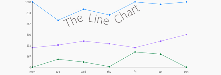
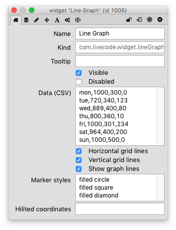
When you first drag the Line Chart out from the tools palette onto your stack you will see it is pre-initialised with a few series of data so you already have something that looks like a chart. All of the properties of the Line Chart are available via the inspector as seen in the image below but I will discuss how to interact with them in code as many of you will want to when using it in your application.
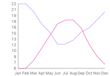
Unarguably the most important property you will need to know about as you start using the Line Chart is the graphData. The graphData is comma and line delimited with the first item of each line being a point on the X axis and each subsequent item on a line being a point on the Y axis of a data series.
For example, using maximum temperature averages (°C) for Edinburgh, Scotland and Geeveston, Tasmania will allow you to easily see why I’m happy I’m allowed to work from home:
local tData
put "Jan,6,22" & return &
       "Feb,6,22" & return &
       "Mar,8,20" & return &
       "Apr,11,17" & return &
       "May,14,15" & return &
       "Jun,17,12" & return &
       "Jul,11,18" & return &
       "Aug,18,13" & return &
       "Sep,16,15" & return &
       "Oct,12,16" & return &
       "Nov,9,18" & return &
       "Dec,7,20" into tData
set the graphData of widget "Line Graph" to tData
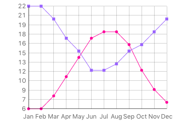
Actually Kevin I’m available to come over any time between mid-May and the end of August 😉
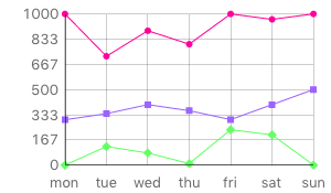
At the moment our chart looks a little busy so it would be nice to clean it up a bit with the following:
set the graphXLines of widget "Line Graph" to false
set the graphYLines of widget "Line Graph" to false
set the markerStyles of widget "Line Graph" to empty
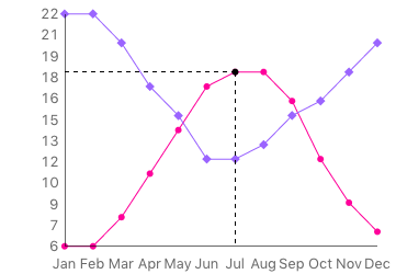
What we are doing here is removing the grid behind the chart and removing the markers from the lines as seen in the following image:
While we are discussing the markerStyles property I’ll just point out that the next post in this series will cover what I needed to do to implement the markerStyles and the showLines properties. These properties are both new in LiveCode 8.1. For now I’ll just explain what you can use these properties for. A marker style may be empty, circle, diamond, square, filled circle, filled diamond or filled square. The showLines governs the line visibility so that you can just show markers:
local tMarkers
put "filled circle" & return & "filled diamond" into tMarkers
set the markerStyles of widget "Line Graph" to tMarkers
set the showLines of widget "Line Graph" to false
Now we end up with a chart like this:
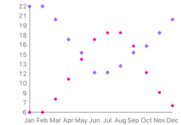
It doesn’t work very well for this data but it’s certainly helpful for some use cases if you want a scatterplot type chart.
We can set the line/marker colors with the graphColors property. For example:
local tNotVeryPretty
put "255,0,0" & return & "0,255,0" into tNotVeryPretty
set the graphColors of widget "Line Graph" to tNotVeryPretty
I won’t add the image because it’s not pretty 😉
The other cool feature that the Line Chart currently has is a hilitedCoordinates property. You can set the hilitedCoordinates to a point on any of the lines on the chart. For example:
local tWhenToGoToEdinburgh
put "Jul,18" into tWhenToGoToEdinburgh
set the hilitedCoordinates of widget "Line Graph" to tWhenToGoToEdinburgh
I’d love to hear how you plan to use the Line Chart so let me know in your comments!
28 comments
Join the conversationPaul - September 7, 2016
Great article Monte, and very helpful! Looking forward to implementing.. This did trigger something on the userlist earlier this year, titled “widgets guide for dummies”, where we were advised that the App Building Course was “currently” being updated to include widgets.. Is this near to being released? Or is there a separate Widget course in the pipeline?
Thanks
Monte Goulding - September 7, 2016
Thanks Paul. The widget course is very nearly ready to be delivered. We also had a full day workshop at the conference.
Paul - September 7, 2016
Ah! Widget Course was mentioned on the Infinite Livecode blog back in May.. to quote “We’re in process of putting together a free online widget building course which will be available to everyone. We’re going to be announcing a series of exciting prizes and incentives for the top widgets (chosen by community vote) at the end of the year. Full details will go up on the blog in the next few days”
Paul Malloy - September 8, 2016
Is it possible to set the range and increments of the Y axis? e.g. temperature ranging from 0 to 100 in 10 degree increments?
Monte Goulding - September 9, 2016
Not yet. This would be a good improvement to make.
Jon Schwartz - April 5, 2018
I’m using a lot of graph points. Both the x and y axis labels are illegible.
Elanor Buchanan - April 10, 2018
Hi Jon
You can either add an enhancement request to improve the display of the axes at https://quality.livecode.com/ or, and we would of course like to encourage this, you could make the changes to the widget yourself.
The rest of this blog series is about modifying the line chart widget, you might find it interesting and helpful.
https://livecode.com/livecode-widgets-modifying-the-line-chart/
https://livecode.com/livecode-widgets-more-line-chart-madness/
Kind regards
Elanor
Paul Malloy - September 8, 2016
And is it possible to insert global variable names in place of integers in a script like you have written for tData above? Thanks.
Monte Goulding - September 9, 2016
It is possible but they won’t be re-evaluated and update the chart when the globals change if that’s what you mean.
Paul Malloy - September 10, 2016
Thanks. Some folks on the forums helped me to get global variables coded properly. I update the values on another card, so they do not need to dynamically update in LineChart—a button on the LineChart page contains a script to do this. I will post the corrected code here as it may be helpful to others. The first code I posted has errors.
Paul Malloy - September 8, 2016
on mouseUp
global gDRSTotT, gTrailsAT, gTrailsBT, gBDST, gCowaT, gBNTT, gBVMIT, gHVLTTotT, gHVLTretainT, gBVMTTotT, gBVMTretainT
local tGraphValues
put “DRS total,” & gDRSTotT & return &
“Trails A,” & gTrailsAT & return &
“Trails B,” & gTrailsBT & return &
“BDS,” & gBDST & return &
“COWA,” & gCowaT & return &
“BNT,” & gBNTT & return &
“Beery VMI,” gBVMIT & & return &
“HVLT learning,” & gHVLTTotT & return &
“HVLT retain,” & gHVLTretainT & return &
“BVMT learning” & gBVMTTotT & return &
“BVMT retain” & gBVMTretainT into tData
set the graphData of widget “Line Graph” to tGraphValues
end mouseUp
Paul Malloy - September 15, 2016
The code above has errors. The correct code follows. Note the need for the backslash:
—get data for Line Graph widget
local tData
put “DRS total,” & gDRSTotZ & return &
“Trails A,” & gTrailsAZ & return &
“Trails B,” & gTrailsBZ & return &
“BDS,” & gBDSZ & return &
“COWA,” & gCowaZ & return &
“BNT,” & gBNTZ & return &
“Animals,” & gAnimalsZ & return &
“Beery VMI,” & gBVMIZ & return &
“HVLT learning,” & gHVLTlearnZ & return &
“HVLT retain,” & gHVLTretainZ & return &
“BVMT learning,” & gBVMTlearnZ & return &
“BVMT retain,” & gBVMTretainZ into tData
set the graphData of widget “Line Graph” to tData
—show the normal vs abnormal score cutoff
local tCutOff
put “BVMT retain, 0” into tCutOff
set the hilitedCoordinates of widget “Line Graph” to tCutOff
Paul Malloy - September 15, 2016
There is a need for backslash after every “Put” line at least on a Mac. I could not paste it.
Jim MacConnell - September 9, 2016
Great article. Most of my charting is date based. Getting data points properly aligned along the X axis while having flexible X-axis labeling would be a really nice feature for the widget to have. Basically define a “type” for the first data point. Use case: having a year’s worth of date based data with the data from Jan 2, 16, 24 and 30 all displayed with just JAN as the X axis label.
Monte Goulding - September 9, 2016
Hi Jim, Yes this is something that would be great to add. Ideally there would be an option do set the x points as datetime with values as long seconds and the chart would scale the range and label appropriately based on the width of the chart.
Larry Walker - September 14, 2016
Monty: This is a very, very handy feature for those of us that are “Swiss-Army-knife” Livecoders!
But when I first saw the preview, if felt to me like, for most of the stuff I’ve randomly done over the years, that the data in the graphData property feels “sideways”.
It makes sense, for say sensor data, where you might acquire two values (diff instruments, diff locations, etc) at each point in time. Each same and its time-stamp make a logical “column” (y-axis-stacked readings) then.
But if I were actually doing your Edinburgh/Geeveston example, I’d likely go to some online weather almanac and copy a line out of some “Average Antipodal Temperatures” website and want to paste it in as one ROW of data, backwards to the current convention.
Perhaps I’m asking for a “pivotData” property, but I’m curious about the thinking behind the Row vs Column orientation of the graphData property…
Great feature; can’t wait to use it for some personal hacks!
Larry
Monte Goulding - September 14, 2016
Hi Larry, I’m not sure about the thinking behind the Row v Column data orientation. It was before my time at the company. Personally I’d like a multi-dimensional array of [][] -> y. But it could also be that there is a dataSeries { row | column} and data delimiter property that just default to the current “column” & comma.
Larry Walker - September 14, 2016
And again, not to pick on a feature I’m very glad to have, but based on having written 2-3 “graphing libraries” for in-house users and used another couple 3rd-party libraries over the years, I’m pretty sure that the next design feature that’s likely to give users (and ME) some heart-burn is that the X-axis values (the months in Monte’s example) are monotonically-spaced: even 1-month intervals.
But if I wish to graph some true X/Y data (like the scattergram that Monte had waved past, a bit) it’s messier. Say if I have some voltage vs temp readings for a new thermocouple I’m testing: the voltage readings will not politely come out at nice even 1v increments (or not in even second/minute increments, perhaps)!
Simple packages (in my experience) tend to flounder when asked to do not-quite-simple tasks; do-everything packages are so complex to work with that no one ends up using them. The balance is ungodly tricky, though in my experience, my favorites started with very, very simple defaults (but NOT including monotonic x-values!) with very clear, thorough, well-edited documentation of the many properties that could be tweaked. They did NOT have “doEverything(ginormous, list, of, optional, params)” type calls either. It seemed to be the case that good clear, taxonomic organization of the docs was generally more of a challenge for the authors (as seen from an end-user-in-a-hurry-to-make-a-graph perspective) than writing a nice efficient graphing package.
I look forward to writing some “wrappers” around graphData to make it more flexible in the ways I’ve mentioned in my two comments…
Larry
Monte Goulding - September 14, 2016
Hi Larry, I think this is also a feature that can be added by scaling numeric X values. If any of them can’t convert to a number then they would be evenly spaced otherwise they would be scaled like the Y values. Ideally series 1 might have x,y values that are not in series 2 and so forth… I guess that’s just dealing with empty y values correctly. It’s a whole new world in LCB and you will see how to add features in the next couple of posts in this series! If you make some changes don’t forget to contribute them on github!
Till Bandi - September 19, 2016
highlightedCoordinates hilitedCoordinates
set the highlightedCoordinates of widget “Line Graph” to tWhenToGoToEdinburgh
works for me only as
set the hilitedCoordinates of widget “Line Graph” to tWhenToGoToEdinburgh
Monte Goulding - September 19, 2016
Right you are! I’ll fix
Jan Steinman - September 22, 2016
Please forgive a newbie if this is obvious or documented somewhere, but can the data be sucked out of a MySQL (or other) database, or easily be taken from some other source?
Comments are talking about sensors and voltages and such, so I’m assuming pasting CSV literal values into a window is not the only way to chart data in LiveCode.
Monte Goulding - September 22, 2016
Yes you can most definitely query a database or any other data source and parse the results into the CSV form required for setting the chart data.
Monty May - November 13, 2016
Enjoyed your post. I googled “livecode graph” in search of a tutorial on how to use it. I have begun lap swimming with the Garmin Swim watch. You can download the data to Garmin Connect but the data appears in a table and I would like to see it as a line chart, e.g., time to complete 1000 meters. I want to graphically see my, I hope, progress. It’s a niche market, but maybe I could make an app for Garmin Swim watch owners who like to see data. I wonder how the numbers are set for the X and Y axes, and will continue to study your blog, hoping that you have covered it.
Oldrich - July 4, 2020
Hi,
I have a questions for this widget:
– how can I adjust colour of background of graph?
– how can I adjust a colour for grid lines and number of grid?
– how can I set the grid lines as dashed?
– how can I set step for grid? The each point has number on axes X Y. For example set the step for grid X=100 and for grid Y = 50 or others
The colour of background I solve by adding a field below the widget and setting the parameter opaque of widget to false. The colour the background I set in this field. I don’t know if these parameters can be set and I just can’t do it or it’s not possible in the current version.
Thanks
Oldrich
Elanor Buchanan - July 7, 2020
Hi Oldrich
You cannot set these properties in this version of the Graph Widget. I have added these items to an existing enhancement request in our Quality Control Center.
https://quality.livecode.com/show_bug.cgi?id=18360
The report is marked as hibernated for now but will be split into separate tasks when it is addressed.
The rest of this blog series is about modifying the line chart widget. If you are interested in modifying the widget yourself to add the properties you might find it interesting and helpful.
https://livecode.com/livecode-widgets-modifying-the-line-chart/
https://livecode.com/livecode-widgets-more-line-chart-madness/
Kind regards
Elanor
raul Mendoza - January 12, 2021
Would it be nice to click any part of the line graph and have the coordinates values displayed??
Elanor Buchanan - January 13, 2021
Hi Raul,
Yes, this would be a nice feature. The Line Graph is fairly basic and there are lots of useful way it could be extended. The next two blog posts in this series explain how to modify the Line Graph widget to add any features you would like.
https://livecode.com/livecode-widgets-modifying-the-line-chart/
https://livecode.com/livecode-widgets-more-line-chart-madness/
I hope that helps.
Kind regards
Elanor