The design of user interfaces has changed substantially since LiveCode was first created. For example, instead of a single font used throughout the UI, modern designs use a variety of different fonts for different purposes, in varying sizes and styles.

LiveCode uses each platform’s theming libraries (where available) to ensure that applications look as close as possible to native applications. Over time, however, the appearance that LiveCode provides and that of native applications have moved apart. In LiveCode 8, we have performed a lot of work in bringing LiveCode back to parity with native applications and to ensure it stays there, even when they change in future.
Native fonts and colours
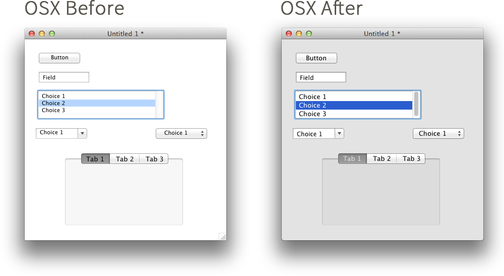
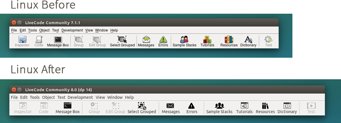
If a control has no colour properties or font set, it will use the default colours and fonts according to the native theme. Up until LiveCode 8, there was only one fallback setting; for example, the fallback font was the same for fields and buttons. But this does not match modern UI conventions: fields and buttons often have different font settings.
In LiveCode 8, the native fallbacks now depend on the type of the control. As can be see in the following screenshots, the difference this makes is quite dramatic:


To take advantage of these changes, all you need to do is use LiveCode 8 – the changes are applied automatically. If you don’t want to use the new appearance, you can set the “theme” property of a control, group, card or stack to “legacy” and the pre-LiveCode 8 appearance will be used. To get the new appearance for an individual control, use “native”.
You can also customise which set of theming fallbacks are used for a control by using the “themeClass” property. For example, to get a field styled as a label instead of an input box, set its “themeClass” to “label”. The list of supported classes can be found in the dictionary.
Text measurements
The other big appearance change in LiveCode 8 is the way text is measured and laid out. The measurements (“metrics”) previously used by LiveCode for text layout were more suited to low-resolution bitmap fonts than the scalable vector fonts that are now ubiquitous. We have updated LiveCode to use more accurate measurements that result in more consistent and better-looking text layout.
This affects all controls that display text but has a particularly large impact on fields. Multi-line fields now look much more like their native counterparts in terms of line spacing and layout. If you want to emulate the previous behaviour, the “fixedLineHeight” and “textHeight” properties of the field can be set in order to get the desired line spacing.
The functions that measure text will also return different values but these should now be more accurate.
The Future
This is only the start of the changes that we’ll be making in the LiveCode 8 series to improve the look-and-feel of applications written in LiveCode. In addition to further improvements and fixes, we have a number of items in our roadmap related to theming… we’ll have more on that in the not-too-distant future!

3 comments
Join the conversationMark Smith - March 9, 2016
Thanks Fraser. This is exciting stuff. The more “authentic” an application looks on a given platform the richer the user experience.
Bo Landgren - March 18, 2016
Hi Fraser!
Do you also have the goal to merge the iOS7Android controls with the Mac/Windows/Linux controls. I mean, to make it possible to drag iOS controls from a palette to the Livecode window so we don’t need to build iOS apps in another way than MacOS X applications?
Mark Wieder - April 9, 2016
Bo – you may want to look at Scott Rossi’s tmControl2 plugin for iOS and some Android drop-in controls.
http://tmtools.tactilemedia.com/tmcontrol2