Are you creating a website or app, developing software, and rushing through your day trying to complete things?
You could probably use the KISS principle.
Sorry, I’m not talking about making out.
KISS is a design principle coined by the US Navy and means: Keep it simple, stupid. If you aren’t keeping a task simple, straightforward, and to the point, you’re probably doing it wrong.
How do you employ the KISS principle?
1) Keep your website, app or spreadsheet free of clutter.
Do you have something on your website or app and you’re not sure why it’s there anymore? Get rid of it. If you aren’t using it, your consumers aren’t either. Get rid of the bulk and direct your users to their destination more clearly and efficiently.
2) Determine the point you’re trying to make and stick to it.
Need to add a bit of new text to your webpage or app intro? Determine what you want the user to understand before you start writing the content. This way, you’ll make your point early and succinctly without rambling and confusing your user.
3) Keep it to one click.
Whether you want your consumers to go to a certain webpage, try a certain section of your app, or buy your product, you need to take them there in one click. Amazon is great at this. When you go there, you log in, find your product, and then in one click – yes, one single click! – you send a book to your kindle or your products are dispatched to you. Amazon eats, lives, and breathes the Keep it simple, stupid principle – and they do it consistently throughout their devices – from their desktop site to their mobile and tablet apps.
4) Don’t be stupid.
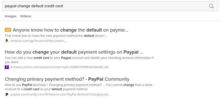
That’s right: when you don’t keep it simple, you’re being a bit, well… stupid. Take PayPal. If you’re like me, you have been using PayPal for awhile and your first credit card has long since expired. …But each time you checkout with PayPal, you need to update your card. Over and over again. I realize there’s probably some way to change the default setting, but so far it’s escaped me.
And the fact that I have to google “PayPal change default card” to try to find an answer doesn’t keep things simple.
If your users don’t understand how to use your website, app, or product and if they have to leave your platform in order to figure it out, you haven’t kept it simple or easy for them and you’re being stupid.
So keep it simple, (not) stupid.
How about you? How do you keep it simple? Share in the comments below!


4 comments
Join the conversationLiveCode - June 10, 2015
How to Keep It Simple: http://t.co/ycHGEFXZC4
Richmond Mathewson - June 10, 2015
https://www.facebook.com/RMLCclasses?fref=nf
Richmond - June 12, 2015
Simple does not necessarily equate with stupid. In fact ‘simple’ often means ‘straight forward’ instead of ‘needlessly complicated’ – and that has always go to be good. So, how about changing things to KISS: Keep it Simple, Sensible?
Jana Doughty - June 15, 2015
Good thoughts, Richmond. Thanks for sharing. I’m not sure the author is saying that being simple is stupid, but rather that to make things less simple or “sensible” as you rightfully put it, is “stupid” in that is makes things harder on you. And life doesn’t have to be that hard.