
As Twitter Bootstrap released version 3 of its powerful front-end framework recently, I thought introducing it to those of you that are doing some webdev and haven’t used it yet would be a good idea.
Note : At this point I assume that you speak a bit of HTML and CSS, and that you have already used jQuery for some of your web projects before as the Javascript library of bootstrap requires jQuery.
“I’ve never heard of Twitter bootstrap, what is it” ?
That’s fine… If you have been living on Mars since it released in 2011 or came to web development later on then you have a decent excuse. Bootstrap is a powerful Javascript and CSS framework that allows you to make high standard responsive websites in minutes. Basically this is providing you with all the Javascript and CSS power you will ever need to build a rich UI. Bootstrap has done all the good work to make sure you will not need to worry too much about Cross-Browser Compatibility check, it’s using the last goodness of HTML5 and CSS3 in an advanced fashion. Bootstrap is open source and so well documented that you do not even need to be a Front-End dev genius to come up with something sexy. I have forgot to mention that Bootstrap has been created by two talented Twitter Developers and that now huge names of the web are using it, like Mailchimp for example. I promise, In less than 10 mins you’ll be all setup to use it.
Let’s get setup then
Download Bootstrap Framework here : https://github.com/twbs/bootstrap/releases/downoload/v3.1.1/bootstrap-3.1.1-dist.zip
Now create a “tutorial” folder and unzip the compressed folder into “tutorial” to see the structure of (the compiled) Bootstrap. You’ll see something like this:
tutorial
├──
   bootstrap/
   ├── css/
   │   ├── bootstrap.css
   │   ├── bootstrap.min.css
   │   ├── bootstrap-theme.css
   │   └── bootstrap-theme.min.css
   ├── js/
   │   ├── bootstrap.js
   │   └── bootstrap.min.js
   └── fonts/
       ├── glyphicons-halflings-regular.eot
       ├── glyphicons-halflings-regular.svg
       ├── glyphicons-halflings-regular.ttf
       └── glyphicons-halflings-regular.woff
What we have here is the most basic form of Bootstrap: precompiled files for quick drop-in usage in nearly any web project. In the example above we will be requiring the minified versions of the CSS and Javascript, the glyphicons files in the fonts folder have been implemented in version 3 to provide a built in icons library, you can preview these icons here : http://getbootstrap.com/components/ we also need jQuery as the bootstrap Javascript requires it.
Let’s build that page now!
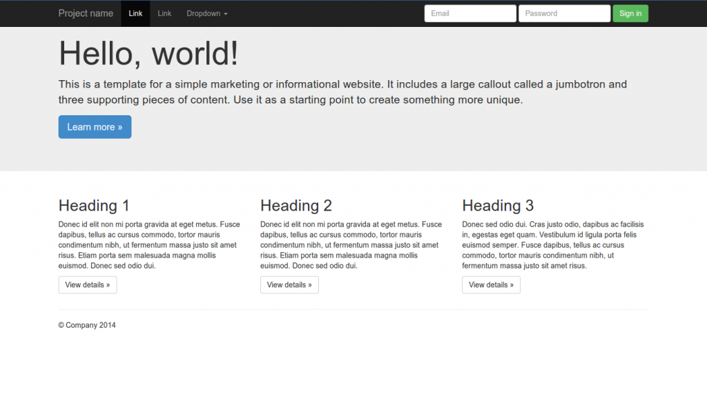
Create an index.html file in the root of “tutorial” folder and paste the following code :
<!DOCTYPE html>
<html lang="en">
<head>
<meta charset="utf-8">
<meta http-equiv="X-UA-Compatible" content="IE=edge">
<meta name="viewport" content="width=device-width, initial-scale=1">
<meta name="description" content="">
<meta name="author" content="">
<title>Jumbotron Template for Bootstrap</title>
<!-- Bootstrap core CSS -->
<link href="css/bootstrap.min.css" rel="stylesheet">
<!-- Custom styles for this template -->
<!-- <link href="jumbotron.css" rel="stylesheet"> -->
</head>
<body>
<div class="navbar navbar-default navbar-fixed-top" role="navigation">
<div class="container">
<div class="navbar-header">
<button type="button" class="navbar-toggle" data-toggle="collapse" data-target=".navbar-collapse">
<span class="sr-only">Toggle navigation</span>
<span class="icon-bar"></span>
<span class="icon-bar"></span>
<span class="icon-bar"></span>
</button>
<a class="navbar-brand" href="#">Project name</a>
</div>
<div class="navbar-collapse collapse">
<form class="navbar-form navbar-right" role="form">
<div class="form-group">
<input type="text" placeholder="Email" class="form-control">
</div>
<div class="form-group">
<input type="password" placeholder="Password" class="form-control">
</div>
<button type="submit" class="btn btn-success">Sign in</button>
</form>
</div><!--/.navbar-collapse -->
</div>
</div>
<!-- Main jumbotron for a primary marketing message or call to action -->
<div class="jumbotron">
<div class="container">
<h1>Hello, world!</h1>
<p>This is a template for a simple marketing or informational website. It includes a large callout called a jumbotron and three supporting pieces of content. Use it as a starting point to create something more unique.</p>
<p><a class="btn btn-primary btn-lg" role="button">Learn more »</a></p>
</div>
</div>
<div class="container">
<!-- Example row of columns -->
<div class="row">
<div class="col-md-4">
<h2>Heading 1</h2>
<p>Donec id elit non mi porta gravida at eget metus. Fusce dapibus, tellus ac cursus commodo, tortor mauris condimentum nibh, ut fermentum massa justo sit amet risus. Etiam porta sem malesuada magna mollis euismod. Donec sed odio dui. </p>
<p><a class="btn btn-default" href="#" role="button">View details »</a></p>
</div>
<div class="col-md-4">
<h2>Heading 2</h2>
<p>Donec id elit non mi porta gravida at eget metus. Fusce dapibus, tellus ac cursus commodo, tortor mauris condimentum nibh, ut fermentum massa justo sit amet risus. Etiam porta sem malesuada magna mollis euismod. Donec sed odio dui. </p>
<p><a class="btn btn-default" href="#" role="button">View details »</a></p>
</div>
<div class="col-md-4">
<h2>Heading 3</h2>
<p>Donec sed odio dui. Cras justo odio, dapibus ac facilisis in, egestas eget quam. Vestibulum id ligula porta felis euismod semper. Fusce dapibus, tellus ac cursus commodo, tortor mauris condimentum nibh, ut fermentum massa justo sit amet risus.</p>
<p><a class="btn btn-default" href="#" role="button">View details »</a></p>
</div>
</div>
<hr>
<footer>
<p>© Company 2014</p>
</footer>
</div> <!-- /container -->
<!-- Bootstrap core JavaScript
================================================== -->
<!-- Placed at the end of the document so the pages load faster -->
<script src="https://ajax.googleapis.com/ajax/libs/jquery/1.11.0/jquery.min.js"></script>
<script src="js/bootstrap.min.js"></script>
</body>
</html>
Note I have been taking this html from the examples they provide here : http://getbootstrap.com/getting-started/#examples
we have been including 3 files – the bootstrap CSS between <head></head>
<link href="css/bootstrap.min.css" rel="stylesheet">
– jQuery from the google apis server and bootstrap javascript from our framework just before closing the </body>
<script src="https://ajax.googleapis.com/ajax/libs/jquery/1.11.0/jquery.min.js"></script> <script src="js/bootstrap.min.js"></script>
Let’s tweak it.
according to this awesome documentation : http://getbootstrap.com/components
We could change the appearance of the top navbar so it would stand up better from the banner that’s above. We can do this by replacing the css class “navbar-default” with “navbar-inverse” in the “navbar” container div tag, the colors we had in the navbar will be inverted. The nav bar container is :
<div class="navbar navbar-default navbar-fixed-top" role="navigation">
So replace the line above with :
<div class="navbar navbar-inverse navbar-fixed-top" role="navigation">
Now let’s add more links into the nav bar, Replace :
<div class="navbar-collapse collapse">
with :
<div class="navbar-collapse collapse">
     <ul class="nav navbar-nav">
        <li class="active"><a href="#">Link</a></li>
        <li><a href="#">Link</a></li>
        <li class="dropdown">
          <a href="#" class="dropdown-toggle" data-toggle="dropdown">Dropdown <b class="caret"></b></a>
          <ul class="dropdown-menu">
            <li><a href="#">Action</a></li>
            <li><a href="#">Another action</a></li>
            <li><a href="#">Something else here</a></li>
            <li class="divider"></li>
            <li><a href="#">Separated link</a></li>
            <li class="divider"></li>
            <li><a href="#">One more separated link</a></li>
          </ul>
        </li>
      </ul>
Note: the code we have added here has to be contained within the div having the class “navbar-collapse”, so the menu items are correctly positionned when you are viewing the page on a mobile, or reducing the viewport.
Let’s add a little fancy icon before Heading 1 Replace:
<h2>Heading 1</h2>
With:
<h2><span class="glyphicon glyphicon-thumbs-up"></span> Heading 1</h2>
You can continue to play adding/tweaking components using the doc here: http://getbootstrap.com/components
Once you have a precise project in mind you will very likely need to change the layout of your pages to design a blog, a store or simple content etc; At this point you will need to get familiar with building within the Bootstrap grid system, organising your content into column and rows that will automatically stack depending on the size of the screen. You will find all you need about the bootstrap grid system here : http://getbootstrap.com/css/
You could also build you own customised framework, bring your branding, colors and select the javascript you need if you do not need the whole bunch of functionalities included in the default framework : http://getbootstrap.com/customize/
This was a quick introduction and I hope that you already realize how much time you could save using this framework.
LiveCode Server and Bootstrap are including the same approach to better, faster, stronger. Spend less time doing more using a short and clean syntax. I believe it is a very good idea to use bootstrap along with your Livecode Server Web Projects, building a stunning responsive website, or simply giving a nice and tidy documentation for your last LiveCode Mobile App.
read more
Recent Comments