
 GBP
GBP EUR
EUR USD
USDResponsive Layout
Description
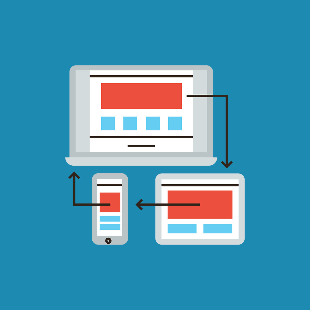
If you need your app to scale in a browser or for different mobile devices, you need the ResponsiveLayout library.
The basic idea of this library is that the user can customize the interface without a single line of code. It consists of a set of properties that can be applied to objects. The three main properties are container, position and content.
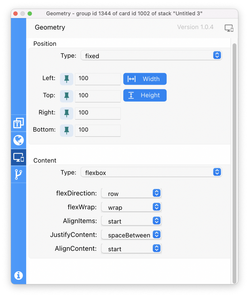
Container: This can be assigned to any control of a card, it defines how the control behaves with respect to its parent.
Example: set the container [“type”] of target to “expanded”
In this example, the control will expand to fill the space left by the other controls.
Position: With this we can position an object with respect to its parent.
Example: set the position [“type”] of target to “center”
In the example the control is positioned in the center of its parent.
Content: This can only be assigned to cards and groups, since, in a card, they are the only ones that can have child controls. This property defines how child controls are arranged within the parent to which the property is assigned.
Example: set the content[“type”] of target to “column”
It will accommodate the children one below the other.
Each of these properties have various types and each type has different properties.
There are more properties, commands and functions, but these three properties are the heart of the library along with the updateLayout command. Read more in our Responsive Layout – In the Spotlight feature.
You must be logged in to leave a review or reply.