
It is very simple to create an application in LiveCode, by dragging objects onto your stack from the Tools Palette and adding code for the messages you want to respond to you can create a simple application in minutes.
This section will cover the basic controls and the most common messages associated with them.
Basic Controls
Stacks
When creating a LiveCode application the first step is to create a new mainstack, you do this by selecting New Mainstack from the File menu.
A new stack is created with 1 card.
Common messages associated with stacks are
- preOpenStack: Sent to the destination card when you open a stack. Any preOpenStack handlers are executed before the stack window appears. Because of this, the preOpenStack handler is a good place to put code that adjusts the size, position, and appearance of objects; the changes are made before the stack appears.
- openStack: Sent to the destination card right after you open a stack. Handle the openStack message to change a stack’s objects, or perform other updates, when the stack is opened. The openStack message is sent after the stack is visible.
- closeStack: Sent to the current card when the stack closes. A stack is closed when the user or a handler closes the stack window. Handle the closeStack message if you want to perform cleanup or do other tasks when the user closes a window.
Cards
A stack consists of one or more cards, each card can have a different appearance and moving between cards changes how the application looks.
Common messages and command associated with cards are
- preOpenCard: Sent to a card when you go to the card. Handle the preOpenCard message to update a card’s appearance before the card appears on screen.
- openCard: Sent to a card right after you go to the card. Handle the openCard message to change a card’s objects, or perform other updates, when the card is visited.
- closeCard: Sent to the current card when the user goes to another card. Handle the closeCard message if you want to perform cleanup or do other tasks when the user leaves a card.
Buttons
There are 6 types of button in the Tools Palette. All these buttons are fundamentally the same but have different default property sets.
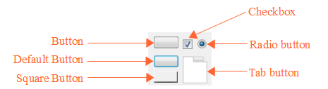
Common messages associated with buttons
- mouseUp: Sent when the user releases the mouse button. Handle the mouseUp message to perform an action when the user releases the mouse button after clicking.
Fields
There are 5 types of field in the Tools Palette. All these fields are fundamentally the same but have different default property sets.
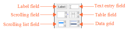
Common messages associated with fields
- openField: Sent to an unlocked field when you click or select text in that field. Handle the openField message if you want to do something when the user enters a field.
- closeField: Sent to a field when the focus is being removed from that field and the field’s content has changed. Handle the closeField message if you want to make sure a field’s content is correct after it has been changed.
- textChanged: Sent when the content of a field has changed. Handle the textChanged message if you want to perform an action when the content of a field changes.
The DataGrid also appears in this section of the Tools Palette. The DataGrid objects allow you to use complex tables and forms into your application.
Menus
There are 4 types of menu in the Tools Palette, menus are buttons with certain properties set that make them behave as menus.
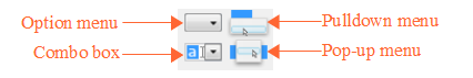
Common messages associated with menus
- menuPick: Sent to a button when a menu item is chosen from the menu associated with that button. Handle the menuPick message to do something when the user chooses a menu item from a button menu, or chooses a tab in a tabbed button.
Scrollbars
There are 4 types of scrollbar in the Tools Palette, all these scrollabars are fundamentally the same but have different default property sets.
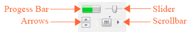
Common messages associated with scrollbars
- scrollbarDrag : Sent to a field, scrollbar, or group when the user drags the scrollbar thumb or when a text selection causes a field to scroll. Handle the scrollbarDrag message if you want to respond to the user dragging the scrollbar thumb.
Images
An image object is a control that contains a bitmapped picture. Use the image object type to hold photographs, icons, and decorative elements, and to allow the user to paint.

You can set the filename property of an image to display an image stored in a separate file.
Players
A player object is a control that displays a movie or sound file. Set the filename property of a player to display a movie or sound from a separate file.

Common messages associated with players
- playStarted: Sent to a player when it starts playing. Handle the playStarted message if you want to perform a task when a movie or sound starts playing.
- playPaused: Sent to a player when the user pauses it. Handle the playPaused message if you want to perform an update when a player is paused.
- playStopped: Sent to a player when it stops playing. Handle the playStopped message if you want to perform a task when a movie or sound finishes playing.
Graphics
The Tools Palette allows you to choose from a selection of shapes when creating a new graphic.

Use the fill bucket to choose the fill color, the fill pencil to choose the line color, the line thickness menu to choose the line thickness, and the optional shape menu to choose preferences specific to the type of graphic selected.
Groups
You can create a group by selecting multiple controls and clicking the Group button in the Menubar.
Once you’ve created the group, it becomes an object in its own right. You can select, copy, move, and resize the group, and all the objects in the group come with it. The objects in the group maintain their own identities, and you can add objects to the group or delete them, but the objects are owned by the group instead of the card.
A group has its own properties and its own script. Groups can be any size, can be shown or hidden, and can be moved to any location in the stack window, just like any other control. Like other controls, groups can be layered in any order with the other controls on the card. Groups can also display a border around a set of objects.
Importing controls
You can also import images into your stack. These become image objects and are part of the stack file. This means that you do not need to include external image files when distributing your application.
To import an image choose Import as Control from the File menu. You can also import Audio and Video files.
Hello World Example
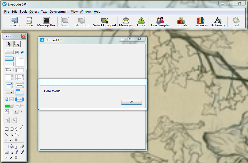
In this section we will create a simple stack consisting of a single button that will display a message to the user. We will use the answer command to display the message. The answer command displays a dialog box with a message and up to seven buttons.
Choose New Mainstack from the File menu. This will create a new stack for you to work with.
Ensure you have Edit mode selected in the Tools Palette.

Drag a button onto your stack.
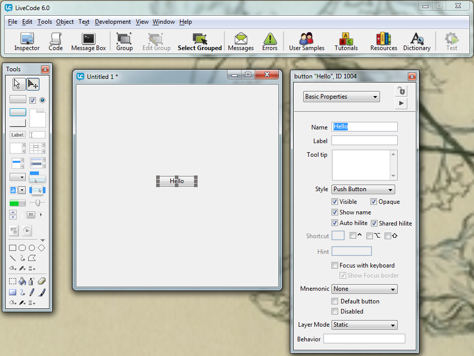
Open the Property Inspector for the button by selecting the button and clicking the Inspector button in the Menubar. Change the name of the button to ìHelloî.
Now open the Code Editor by clicking the Code button in the Menubar. As this is a button the Code Editor is pre-populated with an empty on mouseUp handler.
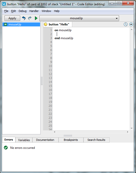
Add the following code to the button
<code>on mouseUp answer "Hello World!" end mouseUp</code>
Click the Apply button, the indicator will change from yellow to green showing there are no errors in the code.
Switch to Run mode, allowing you to interact with the application, and click the button. You will see a dialog box appear displaying the Hello World message.
Stacks with Multiple Cards
Your stacks will often consist of more than one card, multiple cards allow you to display different information on screen and give your user access to different options.
Creating new cards
To add additional cards to your stack select New Card from the Object menu. This will create a new card and go to it.
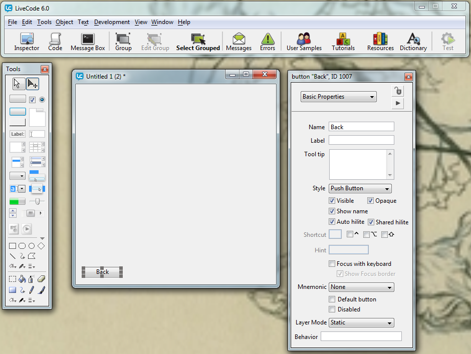
Add a button to this card and name it "Back".
Moving between cards
To move between cards use the Go command. The Go command navigates between cards. The target card can be identified by name, number or position
go to card "edit"
go to card 1
go to the first card
Open the script editor for the button and add the following code
<code>on mouseUp
   go to card 1
end mouseUp</code>
Apply the code and switch to Run mode.
Click the Back button, this will navigate to the first card.
Getting Started