The first step in writing our app is to create the User Interface(UI), we do this by creating a new stack, adding controls to it and setting the properties of these controls to specify how they should look and behave.
Starting a new app
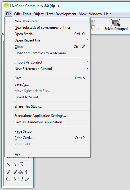
The first step when creating a new app is to create a new Mainstack.
Select New Mainstack from the File menu.
Setting the basic stack properties
For this example we are going to create our app at the same resolution as an iPhone 6, which has a logical resolution of 375 x 667.
There are a large number of different screen resolutions for iOS devices, and even more for Android devices. This is something that you need to consider when developing apps but there are a number of options to allow you to handle this.
This is site provides a quick reference for iOS device resolutions.
These LiveCode lessons explain how to handle different screen resolutions automatically in LiveCode.
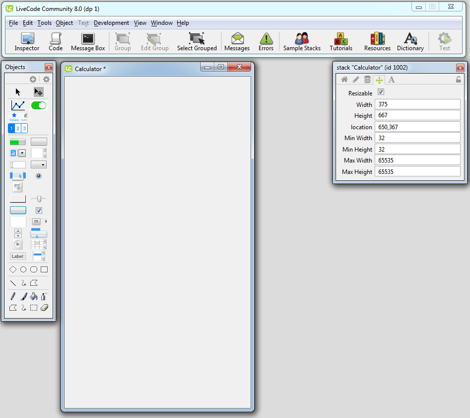
To set the size of a stack we set its Width and Height properties using the Stack Property Inspector.
For more details on the Property Inspector see the LiveCode Environment chapter of the Beginners Guide.
To open the Stack Property Inspector choose Stack Inspector from the Object menu.
The first thing we want to do is give our stack a Name. In the Basic pane of the Property Inspector set the Name of the stack to Calculator.
Next we want to set the size of the stack.
- Select the Position Pane of the Property Inspector
- Set the Width to 375
- Set the Height to 667
- Turn off Resizable, this just means you won’t accidentally resize your stack by dragging
Now save your stack by choosing Save from the File menu.
Adding buttons to the Calculator
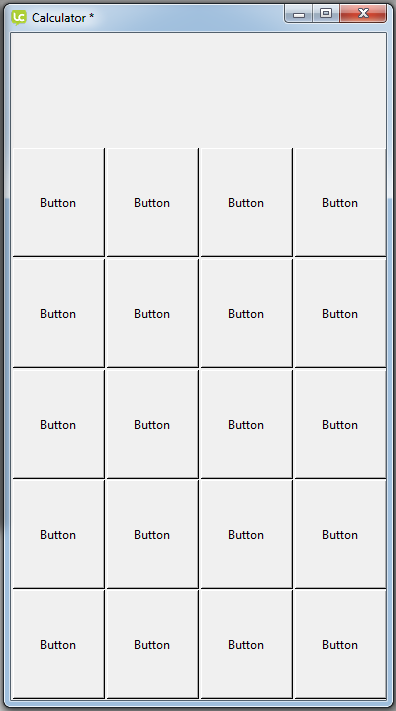
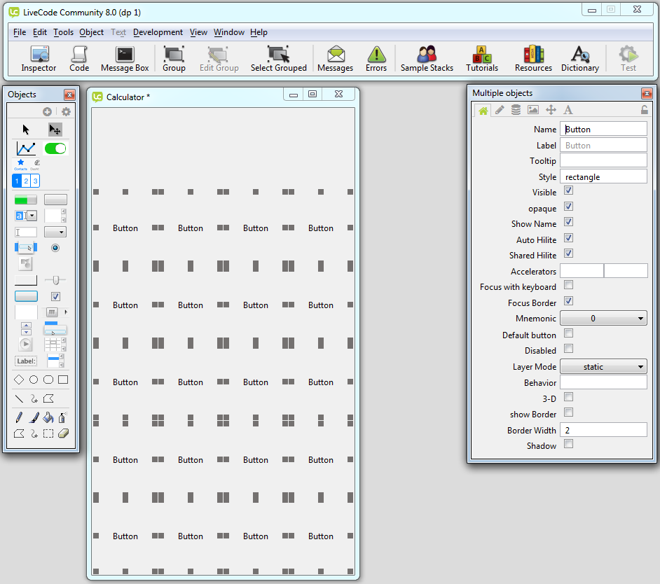
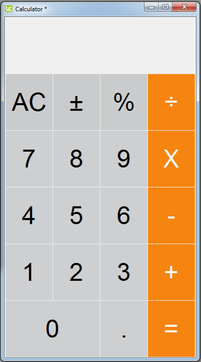
Looking at the Calculator app we can see that it consists of 19 buttons and a field for displaying the result. The first step is to add the 19 buttons to the card.
Start by adding a Rectangle button to the card by dragging it out from the Tools Palette and dropping it onto the card.
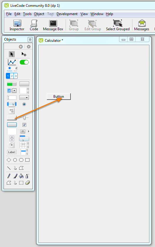
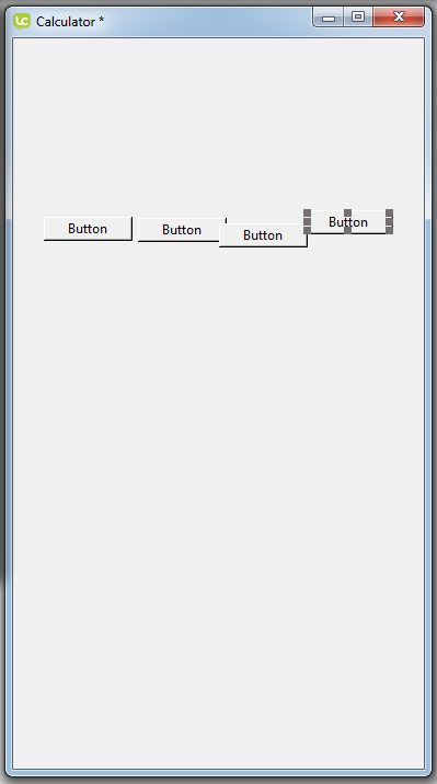
Then drag out 3 more buttons next to it.
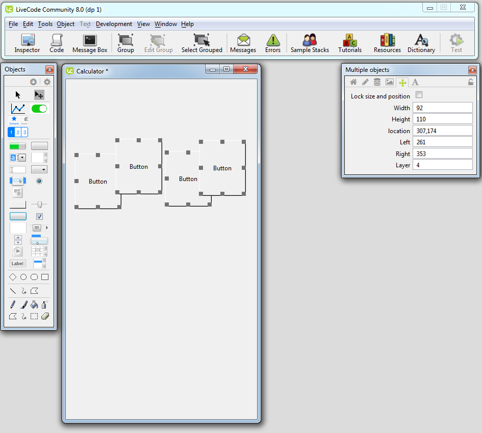
We know the size of our stack and we from this we can calculate what size our buttons should be. In this case we want them to be 92 x 110.
Select all 4 buttons by dragging across them or holding the shift key down and clicking to select them.
In the Position pane of the Property Inspector
- set the Width to 92
- set the Height to 110
Now we want to line out buttons up along their top edge, with the 4 buttons selected choose Align Selected Controls -> Top from the Object menu.
Next lay the 4 buttons out across the card, if you use the right and left arrow keys the vertical position of the buttons won’t change.
Now we have the basic properties of the buttons set up we can just copy and paste them to create the rest of the buttons. You can copy and paste using the keyboard shortcuts or the Edit menu. Copy and paste the 4 buttons 4 times giving us 20
buttons. Then place them on the card.
Setting the button appearance
The next stage is to change the appearance of our basic buttons to look like the buttons in the original Calculator app.
There are a large number of different properties that control the appearance of LiveCode controls but we will only be looking at ones that are relevant to this example for now.
The buttons in the Calculator app have a flat, solid appearance with large text on them, we want to replicate this.
Select all the buttons by dragging across them
-
choose the Basic pane of the Property Inspector
- turn off 3-D
- turn off Show border
-
choose the Icons pane of the Property Inspector
- turn off Hilite Border
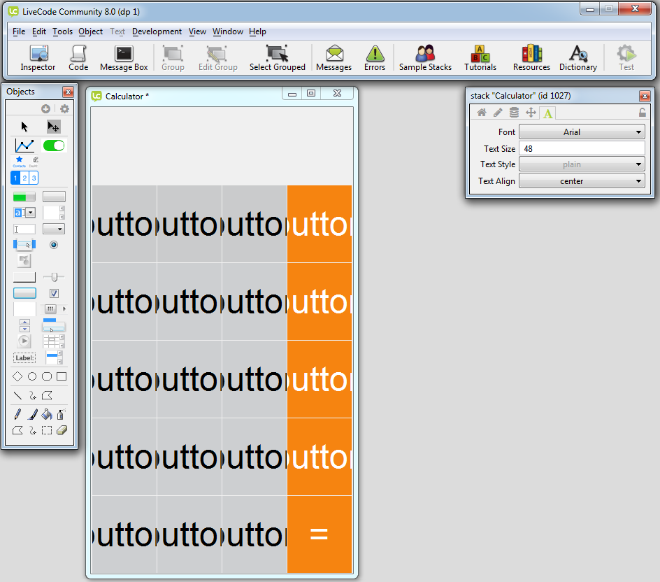
Colours
Next we want to set the colour of the buttons. The 5 operator buttons which appear down the right hand side of the Calculator are orange and the rest of the buttons are grey.
Select the 5 buttons that will be the operators
-
go to the Colors pane of the Property Inspector
- set the Foreground fill to white.
- set the Background fill to orange (246,132,16)
- set the Hilite fill to dark orange, this is the colour the text goes when the button is pressed) (225,117,9)
- set the Border Fill to black

Select the 12 buttons that will be the number buttons
- set the Background fill to light grey (205,207,209)
- set the Hilite fill to dark grey (190,192,194)
- the default text colour is black so we don’t need to set the for these buttons.
Select the 3 other buttons (AC,±,%). These buttons are slightly darker than the number buttons.
- set the Background fill to light grey (202,203,204)
- set the Hilite fill to dark grey (187,188,189)
- the default text colour is black so we don’t need to set the for these buttons.

Text formatting
If we look back at the original Calculator app we can see we need to set the font and size of the text in our app to match.
There are some LiveCode properties that are inherited, so if we set a property of one object that property is automatically set on its children, you can override this property by explicitly setting it on a child object.
For more in property inheritance see Chapter 7.2.4 in the User Guide which can be accessed from the Help menu.
Two properties that can be inherited are the Font and Text Size properties. This means we can set these properties on the stack and all the controls on the stack will inherit these properties. We don’t need to
set them on each individual control, and it’s easy to change them and see the change reflected throughout the app.
To set properties on the stack open the Stack Inspector from the Object menu. Go to the Text pane
- set the Font to Helvetica Neue Thin on Mac or Arial Narrow on Windows. If you don’t have either of these fonts choose Arial, or any other font you like
- set the Text Size to 48
- set the Text Align to center
Now we need to specify what should appear on each of our buttons. We will use 2 properties for this
- Name: the name property is used to refer to the control in code
- Label: the label property is what appears on the button
If a button doesn’t have a Label its Name will be displayed, unless the showName property is false.
In the Basic pane of the Property Inspector set the Name and Label properties of each button
| Name | Label |
|---|---|
| 0 | 0 |
| 1 | 1 |
| 2 | 2 |
| 3 | 3 |
| 4 | 4 |
| 5 | 5 |
| 6 | 6 |
| 7 | 7 |
| 8 | 8 |
| 9 | 9 |
| . | . |
| clear | AC |
| toggle | ± |
| percentage | % |
| divide | ÷ |
| multiply | X |
| minus | – |
| plus | + |
| equals | = |
At this stage we also want to delete the extra button to the right of the 0 button and resize the 0 button.
You can resize the 0 button by selecting at and dragging it wider or by using the Property Inspector to set
- Width to 185
- Left to 2
Setting the background colour
The original Calculator app has a black background. We can set this by setting the background colour of the stack.
Open the Card Inspector from the Object menu
-
In Colors pane
- set the Background Fill to black.

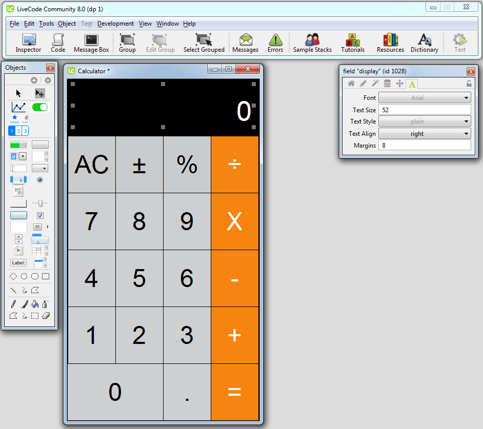
Number display
The final step is to add a field to display calculations.
Drag out a label field from the Tools Palette and stretch it out to fill the space.
Open the Property Inspector for the field from the Object menu.
-
In the Basic pane
- set the Name to "display"
- set the text to 0
- set the Text height to 85
-
In the Colors & Patterns pane
- set the Text color to white
-
In the Text Formatting pane
- set the Text Size to 52