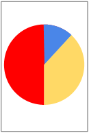
Pie Chart Examples
Everyone is familiar with pie charts, but before we start implementing the pie chart widget we’ll look at a couple of examples.
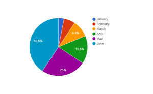
Google Docs
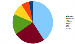
Libre Office
The Pie Chart information
There are 2 main pieces of information required to draw the pie chart
- List of values
- Labels associated with each value
In the examples we looked at, the value and labels were:
- January = 1
- February = 2
- March = 3
- April = 5
- May = 8
- June = 13
The Pie Chart layout
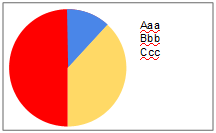
The usual layout for pie charts is to have
- Chart on the left
- List of labels on the right
Because the user can resize the widget there are some considerations for us
- Ensure the labels are shown
- Make the pie chart the maximum size while showing all the labels
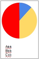
- If the widget is taller than it is wide display the labels below the chart
- Allow the user to choose whether to show the labels or not, to provide flexibility within apps
Pie Chart properties and messages
Through planning our widget we have identified 3 properties the widget needs
- List of values
- List of labels
- Boolean value specifying whether the labels should be shown or not
We also want the widgets to respond to user actions. We could simply provide a mouseUp message but for a pie chart this is not particularly informative. Instead a useful message would tell the user that the chart had been clicked, and which sector was clicked on. So we will send a message with a parameter
- sectorClicked pSectorNumber
The colors used for sectors will be assigned by the widget. A possible extension of the widget would be to make these colors settable by the user.

